Section 9 Quantification Accuracy
To this point we have:
- Provided a data overview: here and here
- Processed the UAS point cloud
- Demonstrated our geometry-based slash pile detection methodology
- Demonstrated our spectral refinement (i.e. data fusion) methodology
- Reviewed how we will evaluate our method
- Made predictions using our method on four experimental sites
- and Evaluated the pile detection accuracy of the structural-plus-spectral data fusion methodology
In this section, we’ll evaluate the effectiveness of the proposed geometric, rules-based slash pile detection methodology by assessing its quantification accuracy performance. We fully reviewed the quantification accuracy assessment workflow here, but here is a quick overview:
While detection accuracy evaluates the ability of the method to correctly locate slash piles, the quantification accuracy assessment measures the precision of the physical pile form dimensions estimated for the successfully identified piles. The quantification accuracy assessment focuses exclusively on TP matches to calculate performance metrics such as Root Mean Square Error (RMSE), Mean Absolute Percentage Error (MAPE), and Mean Error (ME) for pile form measurements height and diameter. Unlike the detection validation which includes all four study sites, this quantification accuracy evaluation is limited to the PSINF Mixed Conifer site where direct field-measured ground truth data is available.
We intentionally limit the quantification accuracy reporting to measurements of height and diameter which were made directly in the field rather than derived volume. To evaluate volume, we will perform a direct comparison between the volumes calculated from our predicted segments and those calculated from field measurements using identical geometric formulas. This comparison functions as a test of measurement consistency rather than a formal accuracy assessment of the remote-sensing method itself. This approach ensures our quantification metrics reflect the actual performance of the detection method instead of a composite error involving sensor noise, field variance, and geometric assumptions. Because both the predicted and field-based volumes rely on the same simplified shape assumptions, any resulting differences are not treated as true errors. Instead, this evaluation highlights how variations in the primary inputs of height and diameter propagate through to the final volume estimate. This distinction is critical because it separates the verifiable accuracy of our sensor-derived physical pile form measurements from the subsequent modeling of three-dimensional space.
9.1 Height and Diameter Accuracy
Let’s evaluate the height and diameter accuracy of our slash pile detection and quantification framework using field measurements for the PSINF site which were taken by measuring the height and diameter (longest side of pile) using a laser hypsometer
We already computed the performance metrics RMSE, MAPE, and ME for pile form measurements height and diameter at the study site and detection methodology level in the prior section using our agg_ground_truth_match() function that we defined earlier
let’s check out what we got
df_temp <-
  agg_ground_truth_match_ans %>%
  dplyr::mutate(
    ref_trees = tp_n+fn_n
    , det_trees = tp_n+fp_n
  ) %>%
  dplyr::select(
    site, method
    # , site_area_m2
    # detection
    , ref_trees
    , det_trees
    , tp_n
    , omission_rate,commission_rate,recall,precision,f_score
    # quantification
    , tidyselect::ends_with("_mean")
    , tidyselect::ends_with("_rmse")
    , tidyselect::ends_with("_mape")
  ) %>%
  # second select to arrange pile_metric
  dplyr::select(
    site, method
    # , site_area_m2
    # detection
    , ref_trees
    , det_trees
    , tp_n
    , omission_rate,commission_rate,recall,precision,f_score
    # quantification
    # , c(tidyselect::contains("volume") & !tidyselect::contains("paraboloid"))
    , tidyselect::contains("area")
    , tidyselect::contains("height")
    , tidyselect::contains("diameter")
  ) %>%
  # names()
  dplyr::mutate(
    dplyr::across(
      .cols = c(
        f_score, recall, precision, tidyselect::ends_with("_mape")
        , tidyselect::ends_with("_rate")
      )
      , .fn = ~ scales::percent(.x, accuracy = 1)
    )
    , dplyr::across(
      .cols = c(tidyselect::ends_with("_mean"))
      , .fn = ~ scales::comma(.x, accuracy = 0.01)
    )
    , dplyr::across(
      .cols = c(tidyselect::ends_with("_rmse"))
      , .fn = ~ scales::comma(.x, accuracy = 0.01)
    )
  )
  # dplyr::glimpse()

  ########################## adj this if want lots of cols
df_temp %>%
  dplyr::inner_join(
    all_stand_boundary %>%
      sf::st_drop_geometry() %>%
      dplyr::filter(site_data_lab == "psinf") %>%
      dplyr::select(site,site_area_ha)
    , by = "site"
  ) %>%
  dplyr::select(
    !tidyselect::contains("_area_")
    & !tidyselect::contains("diff_diameter_")
    & !tidyselect::ends_with("_trees")
    # & !tidyselect::ends_with("_n")
    & !tidyselect::ends_with("_rate")
  ) %>%
  dplyr::select(
    -c(recall,precision,f_score)
  ) %>%
  ########################## adj this if want lots of cols
  # dplyr::glimpse()
  dplyr::relocate(site,method,tp_n) %>%
  dplyr::arrange(site,method) %>%
  kableExtra::kbl(
    caption = "Quantification Accuracy"
    , col.names = c(
      "site", "method", "TP predictions"
      , rep(c("ME","RMSE","MAPE"), times = 2)
    )
    , escape = F
    # , digits = 2
  ) %>%
  kableExtra::kable_styling(font_size = 11.5) %>%
  kableExtra::add_header_above(c(
    " "=3
    # , "Detection" = 3
    # , "Area" = 3
    , "Height (m)" = 3
    , "Diameter (m)" = 3
  )) %>%
  kableExtra::column_spec(seq(3,9,by=3), border_right = TRUE, include_thead = TRUE) %>%
  # kableExtra::column_spec(
  #   column = 3:9
  #   , extra_css = "font-size: 10px;"
  #   , include_thead = T
  # ) %>%
kableExtra::collapse_rows(columns = 1, valign = "top")| site | method | TP predictions | ME | RMSE | MAPE | ME | RMSE | MAPE |
|---|---|---|---|---|---|---|---|---|
| PSINF Mixed Conifer Site | DBSCAN | 115 | -0.07 | 0.67 | 19% | 0.19 | 0.47 | 10% |
| Watershed | 115 | -0.07 | 0.67 | 19% | 0.19 | 0.47 | 10% |
These results demonstrate that the two segmentation methods, DBSCAN and Watershed, show no significant difference in their ability to represent the physical form of correctly identified piles. Because the quantification of pile form is derived directly from the underlying structural CHM data, the two methods naturally yield similar results once a pile is successfully detected. Since both algorithms operate on the same input data to generate measurements for a given location, major differences in quantification accuracy are only expected if there are significant disparities in detection performance. Our detection accuracy evaluation confirmed that both methods performed similarly, and as a result, they produced nearly identical representations of physical pile attributes.
before we compare the measurements in aggregate, let’s look at the distributions
dplyr::bind_rows(
  dbscan_gt_pred_match[["psinf"]] %>% dplyr::filter(match_grp=="true positive") %>% dplyr::mutate(method = "dbscan")
  , watershed_gt_pred_match[["psinf"]] %>% dplyr::filter(match_grp=="true positive") %>% dplyr::mutate(method = "watershed")
) %>%
  dplyr::select(pile_id,method,field_height_m,pred_height_m,field_diameter_m,pred_diameter_m) %>%
  tidyr::pivot_longer(
    cols = -c(pile_id,method)
    , names_to = "metric"
    , values_to = "value"
  ) %>%
  dplyr::mutate(
    which_data = dplyr::case_when(
        stringr::str_starts(metric,"field_") ~ "field"
        , stringr::str_starts(metric,"gt_") ~ "image-annotated"
        , stringr::str_starts(metric,"pred_") ~ "prediction"
        , T ~ "error"
      ) %>%
      ordered()
    , pile_metric = metric %>%
      stringr::str_remove("(_rmse|_rrmse|_mean|_mape)$") %>%
      stringr::str_extract("(area|height|diameter)") %>%
      factor(
        ordered = T
        , levels = c(
          "height"
          , "diameter"
          , "area"
        )
        , labels = c(
          "Height (m)"
          , "Diameter (m)"
          , "Area (m2)"
        )
      )
  ) %>%
  # dplyr::glimpse()
  dplyr::mutate(
    method = method %>%
      factor(ordered = T) %>%
      forcats::fct_recode("DBSCAN" = "dbscan", "Watershed" = "watershed")
  ) %>%
# plot dist
  ggplot2::ggplot(mapping = ggplot2::aes(x = value, color = which_data, fill = which_data)) +
  ggplot2::geom_density(mapping = ggplot2::aes(y=ggplot2::after_stat(scaled)), alpha = 0.7) +
  ggplot2::facet_grid(
    rows = dplyr::vars(method)
    , cols = dplyr::vars(pile_metric)
    , scales = "free_x", axes = "all_x"
    , switch = "y"
  ) +
  harrypotter::scale_color_hp_d(option = "hermionegranger") +
  harrypotter::scale_fill_hp_d(option = "hermionegranger") +
  ggplot2::scale_y_continuous(NULL,breaks=NULL) +
  ggplot2::labs(
    color="",fill="",x=""
    , subtitle = "comparison of height and diameter distributions"
  ) +
  ggplot2::theme_light() +
  ggplot2::theme(
    legend.position = "top"
    , strip.text = ggplot2::element_text(size = 11, color = "black", face = "bold")
    , panel.grid = ggplot2::element_blank()
  )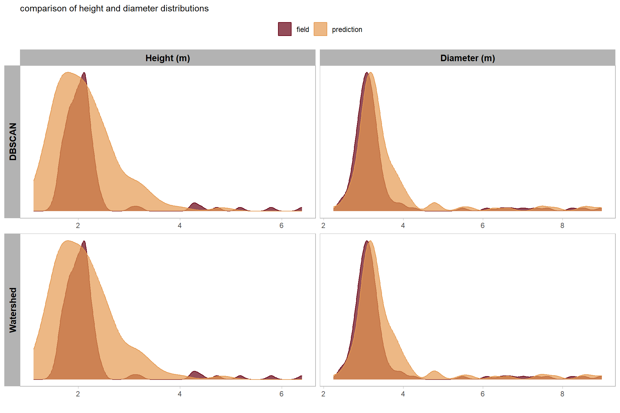
9.1.1 Stand-level Aggregation
Let’s summarize the measurement values of the predictions (true positive and false positive) and the ground truth data (true positive and false negative) over the entire stand (this is similar to a basal area comparison in a forest inventory). Summarizing the predicted and ground truth pile height and diameter form measurements for all instances across the entire study area, regardless of whether individual piles were successfully matched between datasets, for comparison provides insight into the method’s aggregated performance in predicting total pile size in an area. Such totals are often required for administrative needs like submitting burn permits which do not typically focus on individual pile quantification differences.
# sum_df_temp <-
stand_agg_fn <- function(
    df
    ,which_comp = "field" # or "gt"
) {
  df %>%
  dplyr::ungroup() %>%
  dplyr::select(-c(pred_id)) %>%
  dplyr::summarise(
    dplyr::across(
      .cols = tidyselect::starts_with( paste0(which_comp,"_") ) | tidyselect::starts_with("pred_")
      # , ~sum(.x,na.rm=T)
      , list(sum=~sum(.x,na.rm=T), n=~sum(!is.na(.x)) )
    )
  ) %>%
  tidyr::pivot_longer(
    cols = dplyr::everything()
    , names_to = "metric"
    , values_to = "value"
  ) %>%
  dplyr::mutate(
    which_data = dplyr::case_when(
        stringr::str_starts(metric,"field_") ~ "field"
        , stringr::str_starts(metric,"gt_") ~ "image-annotated"
        , stringr::str_starts(metric,"pred_") ~ "prediction"
        , T ~ "error"
      ) %>%
      ordered()
    , pile_metric = metric %>%
      stringr::str_remove("(_rmse|_rrmse|_mean|_mape)$") %>%
      stringr::str_extract("(allom_volume|volume|area|height|diameter)") %>%
      factor(
        ordered = T
        , levels = c(
          "height"
          , "diameter"
          , "area"
          , "allom_volume"
          , "volume"
        )
        , labels = c(
          "Height (m)"
          , "Diameter (m)"
          , "Area (m2)"
          # , "Allometric Volume (m3)"
          # , "Volume (m3)"
          , "reference paraboloid vs\npredicted paraboloid Volume (m3)"
          , "reference paraboloid vs\npredicted irregular Volume (m3)"
        )
      )
    , which_value = stringr::word(metric,-1,sep = "_")
  ) %>%
  dplyr::select(-c(metric)) %>%
  tidyr::pivot_wider(names_from = which_value, values_from = value) %>%
  dplyr::rename(value=sum) %>%
  dplyr::group_by(pile_metric) %>%
  dplyr::arrange(pile_metric,which_data) %>%
  dplyr::mutate(
    pct_diff = (value-dplyr::lag(value))/dplyr::lag(value)
  ) %>%
  dplyr::ungroup()
}
# do it
sum_df_temp <-
  dplyr::bind_rows(
    dbscan_gt_pred_match[["psinf"]] %>% stand_agg_fn() %>% dplyr::mutate(method = "dbscan")
    , watershed_gt_pred_match[["psinf"]] %>% stand_agg_fn() %>% dplyr::mutate(method = "watershed")
  ) %>%
  dplyr::filter(
    !stringr::str_detect(tolower(pile_metric),"volume")
    , !stringr::str_detect(tolower(pile_metric),"area")
  )
# sum_df_temp %>% dplyr::glimpse()
# dbscan_gt_pred_match[["psinf"]] %>% stand_agg_fn() %>% dplyr::mutate(method = "dbscan")
plot the aggregated, stand-level height and diameter comparison between field-measured and predicted piles
# plot it
sum_df_temp %>%
  dplyr::ungroup() %>%
  dplyr::mutate(
    stand_id=1
    , lab = paste0(
      scales::comma(value,accuracy=0.1)
      , dplyr::case_when(
        is.na(pct_diff) ~ ""
        , T ~ paste0(
          "\n"
          , ifelse(pct_diff<0,"-","+")
          ,scales::percent(abs(pct_diff),accuracy=0.1)
        )
      )
    )
    , method = method %>%
      factor(ordered = T) %>%
      forcats::fct_recode("DBSCAN" = "dbscan", "Watershed" = "watershed")
  ) %>%
  ggplot2::ggplot(
    mapping = ggplot2::aes(
      x = which_data
      , y = value
      , label = lab
      , group = stand_id
    )
  ) +
  ggplot2::geom_line(key_glyph = "point", alpha = 0.7, color = "gray", lwd = 1.1) +
  ggplot2::geom_col(mapping = ggplot2::aes(fill = which_data), alpha = 1, width = 0.4) +
  harrypotter::scale_color_hp_d(option = "hermionegranger") +
  harrypotter::scale_fill_hp_d(option = "hermionegranger") +
  ggplot2::geom_text(
    vjust = -0.25
  ) +
  ggplot2::facet_grid(
    rows = dplyr::vars(pile_metric)
    , cols = dplyr::vars(method)
    , scales = "free_y", axes = "all_x"
    , switch = "y"
  ) +
  ggplot2::scale_y_continuous(labels = scales::comma, expand = ggplot2::expansion(mult = c(0,.3)), breaks = NULL) +
  ggplot2::labs(
    x = "", y = ""
    , subtitle = "Comparison of aggregated measurements at the PSINF site"
  ) +
  ggplot2::theme_light() +
  ggplot2::theme(
    legend.position = "none"
    , axis.text.x = ggplot2::element_text(size = 11, color = "black", face = "bold")
    , strip.text = ggplot2::element_text(size = 11, color = "black", face = "bold")
    , panel.grid = ggplot2::element_blank()
) 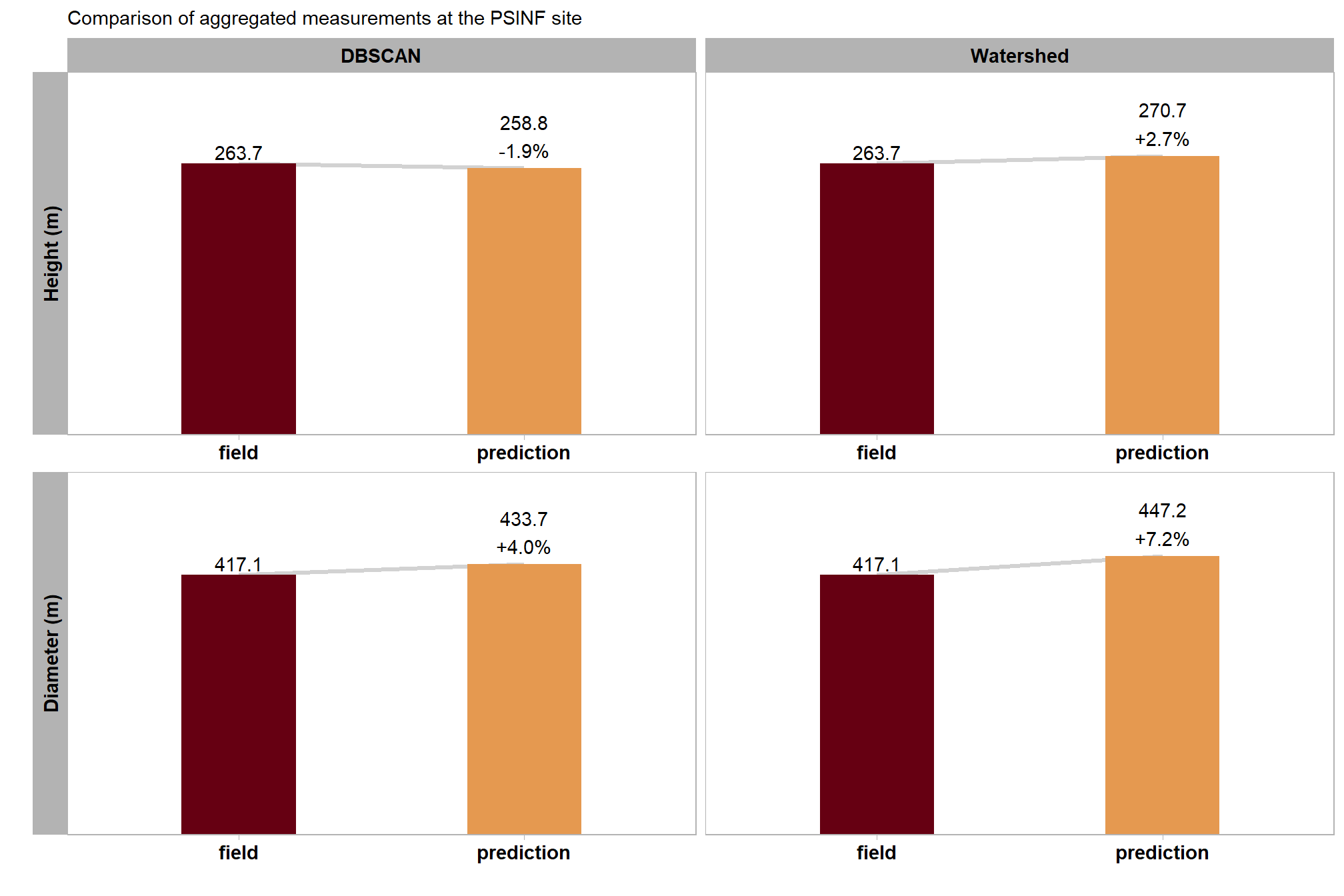
table the aggregated, stand-level height and diameter comparison between field-measured and predicted piles
sum_df_temp %>%
  dplyr::mutate(
    pile_metric=stringr::word(pile_metric)
    , value = scales::comma(value,accuracy=0.1)
    , pct_diff = scales::percent(pct_diff,accuracy=0.1)
  ) %>%
  tidyr::pivot_wider(
    id_cols = method
    , values_from = c(value,pct_diff)
    , names_from = c(pile_metric,which_data)
  ) %>%
  dplyr::select(dplyr::where(~ !all(is.na(.x)))) %>%
  dplyr::rename_with(
    .cols = dplyr::everything()
    , .fn = ~ dplyr::case_when(
      stringr::str_starts(.x,"value_") ~ stringr::str_remove(.x,"^value_") %>% stringr::str_c("_value")
      , stringr::str_starts(.x,"pct_diff_") ~ stringr::str_remove(.x,"^pct_diff_") %>% stringr::str_c("_zzpct_diff")
      , T ~ .x
    )
  ) %>%
  dplyr::select(order(colnames(.))) %>%
  dplyr::mutate(site = all_stand_boundary %>% dplyr::filter(site_data_lab=="psinf") %>% dplyr::pull(site)) %>%
  dplyr::relocate(site,method) %>%
  dplyr::arrange(site,method) %>%
  kableExtra::kbl(
    caption = "Comparison of aggregated measurements at the PSINF site"
    , col.names = c(
      "site", "method"
      , rep(c("Field","Predicted","Pct Diff"), times = 2)
    )
    , escape = F
    # , digits = 2
  ) %>%
  kableExtra::kable_styling(font_size = 11.5) %>%
  kableExtra::add_header_above(c(
    " "=2
    # , "Detection" = 3
    # , "Area" = 3
    , "Diameter (m)" = 3
    , "Height (m)" = 3
  )) %>%
  kableExtra::column_spec(seq(2,8,by=3), border_right = TRUE, include_thead = TRUE) %>%
  # kableExtra::column_spec(
  #   column = 3:9
  #   , extra_css = "font-size: 10px;"
  #   , include_thead = T
  # ) %>%
kableExtra::collapse_rows(columns = 1, valign = "top")| site | method | Field | Predicted | Pct Diff | Field | Predicted | Pct Diff |
|---|---|---|---|---|---|---|---|
| PSINF Mixed Conifer Site | dbscan | 417.1 | 433.7 | 4.0% | 263.7 | 258.8 | -1.9% |
| watershed | 417.1 | 447.2 | 7.2% | 263.7 | 270.7 | 2.7% |
9.2 Area Accuracy
We could also evaluate quantification accuracy using pile areas based on the image annotations, though these are less presumptive than the “gold standard” field measurements. These annotations were occasionally limited by the difficulty of pinpointing exact pile boundaries, even when using high-resolution RGB data. Despite the potential for human error in the digitizing process, these area measurements provide additional validation data that is available across all four study sites.
  ########################## adj this if want lots of cols
df_temp %>%
  dplyr::select(
    !tidyselect::contains("_height_")
    & !tidyselect::contains("_diameter_")
    & !tidyselect::ends_with("_trees")
    # & !tidyselect::ends_with("_n")
    & !tidyselect::ends_with("_rate")
  ) %>%
  dplyr::select(
    -c(recall,precision,f_score)
  ) %>%
  ########################## adj this if want lots of cols
  # dplyr::glimpse()
  dplyr::relocate(site,method,tp_n) %>%
  dplyr::arrange(site,method) %>%
  kableExtra::kbl(
    caption = "Quantification Accuracy"
    , col.names = c(
      "site", "method", "TP predictions"
      , rep(c("ME","RMSE","MAPE"), times = 1)
    )
    , escape = F
    # , digits = 2
  ) %>%
  kableExtra::kable_styling(font_size = 11.5) %>%
  kableExtra::add_header_above(c(
    " "=3
    # , "Detection" = 3
    # , "Area" = 3
    , "Area (m<sup>2</sup>)" = 3

  ), escape = F) %>%
  kableExtra::column_spec(seq(3,6,by=3), border_right = TRUE, include_thead = TRUE) %>%
  # kableExtra::column_spec(
  #   column = 3:9
  #   , extra_css = "font-size: 10px;"
  #   , include_thead = T
  # ) %>%
kableExtra::collapse_rows(columns = 1, valign = "top")| site | method | TP predictions | ME | RMSE | MAPE |
|---|---|---|---|---|---|
| ARNF Ponderosa Pine Site | DBSCAN | 18 | 12.76 | 16.59 | 4% |
| Watershed | 18 | 13.33 | 16.95 | 4% | |
| BHEF Ponderosa Pine Site | DBSCAN | 24 | -24.85 | 48.39 | 15% |
| Watershed | 24 | -24.86 | 48.35 | 15% | |
| PSINF Mixed Conifer Site | DBSCAN | 115 | -0.78 | 2.05 | 10% |
| Watershed | 115 | -0.78 | 2.05 | 10% | |
| TRFO-BLM Pinyon-Juniper Site | DBSCAN | 245 | -0.95 | 1.75 | 13% |
| Watershed | 245 | -0.95 | 1.75 | 13% |
These results further confirm that the two segmentation methods yield similar quantification accuracies for pile area, mirroring the patterns observed for height and diameter. While the absolute area accuracy naturally varies across study sites according to the average pile size, the MAPE remains decently low, ranging between 3.5% and 14.9% across all locations. These metrics suggest that both DBSCAN and Watershed are capable of delineating pile boundaries with acceptable precision.
before we compare the measurements in aggregate, let’s look at the distributions
all_stand_boundary$site_data_lab %>%
  purrr::map(
    \(x)
    dplyr::bind_rows(
      dbscan_gt_pred_match[[x]] %>%
        dplyr::filter(match_grp=="true positive") %>%
        dplyr::select(pile_id,gt_area_m2,pred_area_m2) %>%
        dplyr::mutate(
          method = "dbscan"
          , site = all_stand_boundary %>% dplyr::filter(site_data_lab==x) %>% dplyr::pull(site)
        )
      , watershed_gt_pred_match[[x]] %>%
      dplyr::filter(match_grp=="true positive") %>%
        dplyr::select(pile_id,gt_area_m2,pred_area_m2) %>%
        dplyr::mutate(
          method = "watershed"
          , site = all_stand_boundary %>% dplyr::filter(site_data_lab==x) %>% dplyr::pull(site)
        )
    )
  ) %>%
  dplyr::bind_rows() %>%
  tidyr::pivot_longer(
    cols = -c(site,pile_id,method)
    , names_to = "metric"
    , values_to = "value"
  ) %>%
  dplyr::mutate(
    which_data = dplyr::case_when(
        stringr::str_starts(metric,"field_") ~ "field"
        , stringr::str_starts(metric,"gt_") ~ "image-annotated"
        , stringr::str_starts(metric,"pred_") ~ "prediction"
        , T ~ "error"
      ) %>%
      ordered()
    , pile_metric = metric %>%
      stringr::str_remove("(_rmse|_rrmse|_mean|_mape)$") %>%
      stringr::str_extract("(area|height|diameter)") %>%
      factor(
        ordered = T
        , levels = c(
          "height"
          , "diameter"
          , "area"
        )
        , labels = c(
          "Height (m)"
          , "Diameter (m)"
          , "Area (m2)"
        )
      )
  ) %>%
  # dplyr::glimpse()
  dplyr::mutate(
    site = stringr::word(site)
    , method = method %>%
      factor(ordered = T) %>%
      forcats::fct_recode("DBSCAN" = "dbscan", "Watershed" = "watershed")
  ) %>%
# plot dist
  ggplot2::ggplot(mapping = ggplot2::aes(x = value, color = which_data, fill = which_data)) +
  ggplot2::geom_density(mapping = ggplot2::aes(y=ggplot2::after_stat(scaled)), alpha = 0.7) +
  ggplot2::facet_grid(
    rows = dplyr::vars(method)
    , cols = dplyr::vars(site)
    , scales = "free_x", axes = "all_x"
    , switch = "y"
  ) +
  harrypotter::scale_color_hp_d(option = "hermionegranger") +
  harrypotter::scale_fill_hp_d(option = "hermionegranger") +
  ggplot2::scale_y_continuous(NULL,breaks=NULL) +
  ggplot2::labs(
    color="",fill=""
    , x=latex2exp::TeX("area $m^2$")
    , subtitle = latex2exp::TeX("Comparison of pile Area ($m^2$) distributions")
  ) +
  ggplot2::theme_light() +
  ggplot2::theme(
    legend.position = "top"
    , strip.text = ggplot2::element_text(size = 11, color = "black", face = "bold")
    , panel.grid = ggplot2::element_blank()
  )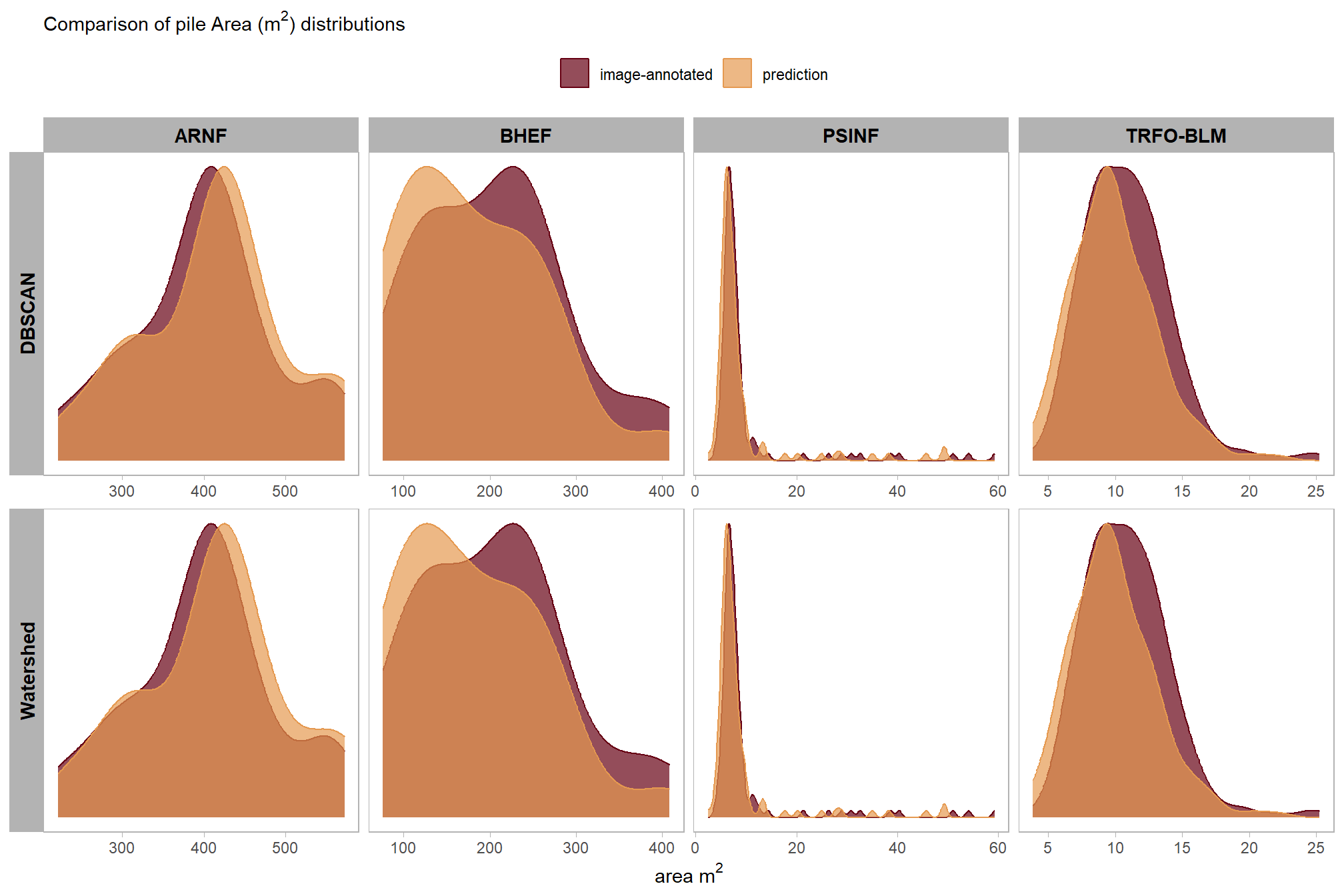
9.2.1 Stand-level Aggregation
Let’s summarize the measurement values of the predictions (true positive and false positive) and the ground truth data (true positive and false negative) over the entire stand (this is similar to a basal area comparison in a forest inventory). Summarizing the predicted and ground truth pile height and diameter form measurements for all instances across the entire study area, regardless of whether individual piles were successfully matched between datasets, for comparison provides insight into the method’s aggregated performance in predicting total pile size in an area. Such totals are often required for administrative needs like submitting burn permits which do not typically focus on individual pile quantification differences.
# do it
sum_df_temp <-
  all_stand_boundary$site_data_lab %>%
  purrr::map(
    \(x)
    dplyr::bind_rows(
      dbscan_gt_pred_match[[x]] %>%
        stand_agg_fn(which_comp = "gt") %>%
        dplyr::mutate(
          method = "dbscan"
          , site = all_stand_boundary %>% dplyr::filter(site_data_lab==x) %>% dplyr::pull(site)
        )
      , watershed_gt_pred_match[[x]] %>%
        stand_agg_fn(which_comp = "gt") %>%
        dplyr::mutate(
          method = "watershed"
          , site = all_stand_boundary %>% dplyr::filter(site_data_lab==x) %>% dplyr::pull(site)
        )
    ) %>%
    dplyr::filter(
      stringr::str_detect(tolower(pile_metric),"area")
    )
  ) %>%
  dplyr::bind_rows()

# sum_df_temp %>% dplyr::glimpse()
plot the aggregated, stand-level area comparison between image-annotated and predicted piles
# plot it
sum_df_temp %>%
  dplyr::ungroup() %>%
  dplyr::mutate(
    stand_id=1
    , lab = paste0(
      scales::comma(value,accuracy=0.1)
      , dplyr::case_when(
        is.na(pct_diff) ~ ""
        , T ~ paste0(
          "\n"
          , ifelse(pct_diff<0,"-","+")
          ,scales::percent(abs(pct_diff),accuracy=0.1)
        )
      )
    )
  ) %>%
  dplyr::mutate(
    site = stringr::word(site)
    , method = method %>%
      factor(ordered = T) %>%
      forcats::fct_recode("DBSCAN" = "dbscan", "Watershed" = "watershed")
  ) %>%
  ggplot2::ggplot(
    mapping = ggplot2::aes(
      x = which_data
      , y = value
      , label = lab
      , group = stand_id
    )
  ) +
  ggplot2::geom_line(key_glyph = "point", alpha = 0.7, color = "gray", lwd = 1.1) +
  ggplot2::geom_col(mapping = ggplot2::aes(fill = which_data), alpha = 1, width = 0.4) +
  harrypotter::scale_color_hp_d(option = "hermionegranger") +
  harrypotter::scale_fill_hp_d(option = "hermionegranger") +
  ggplot2::geom_text(
    vjust = -0.25
  ) +
  ggplot2::facet_grid(
    rows = dplyr::vars(site)
    , cols = dplyr::vars(method)
    , scales = "free_y", axes = "all_x"
    , switch = "y"
  ) +
  ggplot2::scale_y_continuous(labels = scales::comma, expand = ggplot2::expansion(mult = c(0,.3)), breaks = NULL) +
  ggplot2::labs(
    x = "", y = ""
    , subtitle =
      latex2exp::TeX("Comparison of aggregated pile Area ($m^2$) measurements for all sites")
  ) +
  ggplot2::theme_light() +
  ggplot2::theme(
    legend.position = "none"
    , axis.text.x = ggplot2::element_text(size = 11, color = "black", face = "bold")
    , strip.text = ggplot2::element_text(size = 11, color = "black", face = "bold")
    , panel.grid = ggplot2::element_blank()
) 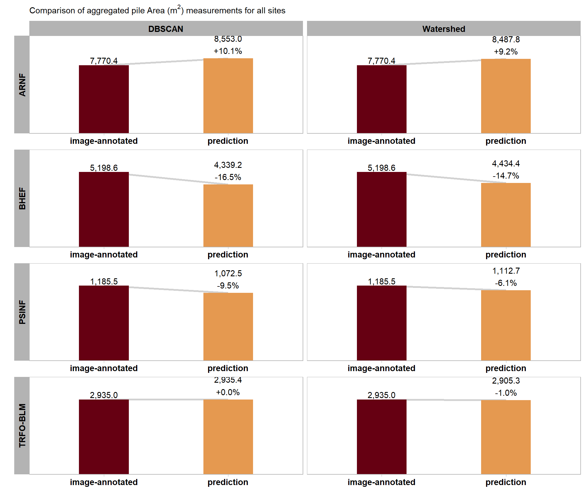
table the aggregated, stand-level area comparison between image-annotated and predicted piles
sum_df_temp %>%
  dplyr::mutate(
    pile_metric=stringr::word(pile_metric)
    , value = scales::comma(value,accuracy=0.1)
    , pct_diff = scales::percent(pct_diff,accuracy=0.1)
  ) %>%
  tidyr::pivot_wider(
    id_cols = c(site,method)
    , values_from = c(value,pct_diff)
    , names_from = c(pile_metric,which_data)
  ) %>%
  dplyr::select(dplyr::where(~ !all(is.na(.x)))) %>%
  dplyr::rename_with(
    .cols = dplyr::everything()
    , .fn = ~ dplyr::case_when(
      stringr::str_starts(.x,"value_") ~ stringr::str_remove(.x,"^value_") %>% stringr::str_c("_value")
      , stringr::str_starts(.x,"pct_diff_") ~ stringr::str_remove(.x,"^pct_diff_") %>% stringr::str_c("_zzpct_diff")
      , T ~ .x
    )
  ) %>%
  dplyr::select(order(colnames(.))) %>%
  dplyr::relocate(site,method) %>%
  # dplyr::glimpse()
  dplyr::arrange(site,method) %>%
  kableExtra::kbl(
    caption = "Comparison of aggregated area measurements for all sites"
    , col.names = c(
      "site", "method"
      , rep(c("Image-annotated","Predicted","Pct Diff"), times = 1)
    )
    , escape = F
    # , digits = 2
  ) %>%
  kableExtra::kable_styling(font_size = 11.5) %>%
  kableExtra::add_header_above(c(
    " "=2
    # , "Detection" = 3
    # , "Area" = 3
    , "Area (m<sup>2</sup>)" = 3
  ),escape = F) %>%
  kableExtra::column_spec(seq(2,5,by=3), border_right = TRUE, include_thead = TRUE) %>%
  # kableExtra::column_spec(
  #   column = 3:9
  #   , extra_css = "font-size: 10px;"
  #   , include_thead = T
  # ) %>%
kableExtra::collapse_rows(columns = 1, valign = "top")| site | method | Image-annotated | Predicted | Pct Diff |
|---|---|---|---|---|
| ARNF Ponderosa Pine Site | dbscan | 7,770.4 | 8,553.0 | 10.1% |
| watershed | 7,770.4 | 8,487.8 | 9.2% | |
| BHEF Ponderosa Pine Site | dbscan | 5,198.6 | 4,339.2 | -16.5% |
| watershed | 5,198.6 | 4,434.4 | -14.7% | |
| PSINF Mixed Conifer Site | dbscan | 1,185.5 | 1,072.5 | -9.5% |
| watershed | 1,185.5 | 1,112.7 | -6.1% | |
| TRFO-BLM Pinyon-Juniper Site | dbscan | 2,935.0 | 2,935.4 | 0.0% |
| watershed | 2,935.0 | 2,905.3 | -1.0% |
9.3 Regression-based Assessment
Fit predicted versus reference values for the correctly detected slash piles (a) diameter and (b) height for the PSINF study site and (c) 2D area for all four study sites. The solid dark line represents a 1:1 relationship while the gray dashed line indicates a simple linear regression fit.
The slope and intercept of the regression will provide insight into how well the framework represents pile dimensional measurements across the entire range of pile sizes available in the reference data. The coefficient of determination (R2) will tell us how well the variability in the reference pile size is explained by the predicted values. In other words, a high R2 means that our method for quantifying slash pile form successfully captures the trend of the data: we predict larger piles when reference piles are larger and vice-versa.
9.3.1 Figure 4
####################################
# height scatter
####################################
# # get prediction for r2
lm_temp <- lm(
  pred_height_m ~ field_height_m
  , data =
    dbscan_gt_pred_match[["psinf"]] %>%
    dplyr::filter(match_grp=="true positive")
)
# summary(lm_temp)
# scales::percent(summary(lm_temp)$r.squared, accuracy = 0.1)
# summary(lm_temp) %>% names()
lmf_temp <- paste0(
  "y = "
  , scales::number(summary(lm_temp)$coefficients[2,1], accuracy = 0.01) #slope
  , "x"
  , ifelse(summary(lm_temp)$coefficients[1,1]<0," - ", " + ")
  , scales::number(abs(summary(lm_temp)$coefficients[1,1]), accuracy = 0.01) #intercept
)
# agg_ground_truth_match_ans %>% dplyr::glimpse()
# agg_ground_truth_match_ans %>% dplyr::filter(site_data_lab=="psinf", tolower(method)=="dbscan") %>% dplyr::pull(diff_field_height_m_rmse)
height_comp_scatter1 <-
  dbscan_gt_pred_match[["psinf"]] %>%
  dplyr::filter(match_grp=="true positive") %>%
  dplyr::bind_cols(
    all_stand_boundary %>%
      sf::st_drop_geometry() %>%
      dplyr::filter(site_data_lab=="psinf") %>%
      dplyr::select(site_data_lab, site_full_lab)
  ) %>%
  ggplot2::ggplot(mapping = ggplot2::aes(y = pred_height_m, x = field_height_m)) +
  ggplot2::geom_abline(color = "gray33", lwd = 1) +
  ggplot2::geom_point(color = "navy", alpha = 0.7, size = 1.5) +
  ggplot2::geom_smooth(lwd = 0.8, method = "lm", se=F, color = "gray", linetype = "dashed") +
  ggplot2::annotate(
    "text",
    x = -Inf, y = Inf # Top Left
    , label =
      paste0(
        "RMSE = "
        , agg_ground_truth_match_ans %>%
          dplyr::filter(site_data_lab=="psinf", tolower(method)=="dbscan") %>%
          dplyr::pull(diff_field_height_m_rmse) %>%
          scales::number(accuracy = 0.01, suffix = " (m)")
        , "\nMAPE = "
        , agg_ground_truth_match_ans %>%
          dplyr::filter(site_data_lab=="psinf", tolower(method)=="dbscan") %>%
          dplyr::pull(pct_diff_field_height_m_mape) %>%
          scales::percent(accuracy = 0.1)
        , "\n"
        , lmf_temp
        , "\n R² = "
        # , scales::number((summary(lm_temp)$r.squared)*100, accuracy = 0.1, suffix = "%")
        , scales::number((summary(lm_temp)$r.squared), accuracy = 0.01)
      )
    , hjust = -0.1, vjust = 1.1
    , parse = F
    , size = 3.5
  ) +
  ggplot2::scale_x_continuous(limits = c(0, max( max(dbscan_gt_pred_match[["psinf"]]$pred_height_m,na.rm=T), max(dbscan_gt_pred_match[["psinf"]]$field_height_m,na.rm=T) )*1.02 )) +
  ggplot2::scale_y_continuous(limits = c(0, max( max(dbscan_gt_pred_match[["psinf"]]$pred_height_m,na.rm=T), max(dbscan_gt_pred_match[["psinf"]]$field_height_m,na.rm=T) )*1.02 )) +
  ggplot2::facet_wrap(facets = dplyr::vars(site_full_lab), scales = "free", axis.labels = "all") +
  ggplot2::labs(
    x = "reference height (m)" # latex2exp::TeX("reference paraboloid volume $m^3$")
    , y = "predicted height (m)" # latex2exp::TeX("predicted irregular CHM volume $m^3$")
    # , color = "image-field\ndiameter diff."
    # , subtitle = latex2exp::TeX("bulk volume ($m^3$) comparison")
    , subtitle = "(b) Predicted Height versus Reference Height"
  ) +
  ggplot2::theme_light() +
  ggplot2::theme(
    plot.subtitle = ggplot2::element_text(face = "bold")
    , strip.text = ggplot2::element_text(face = "bold", color = "black")
  )
# height_comp_scatter1
####################################
# diameter scatter
####################################
# get prediction for r2
lm_temp <- lm(
  pred_diameter_m ~ field_diameter_m
  , data =
    dbscan_gt_pred_match[["psinf"]] %>%
    dplyr::filter(match_grp=="true positive")
)
# summary(lm_temp)
# scales::percent(summary(lm_temp)$r.squared, accuracy = 0.1)
lmf_temp <- paste0(
  "y = "
  , scales::number(summary(lm_temp)$coefficients[2,1], accuracy = 0.01) #slope
  , "x"
  , ifelse(summary(lm_temp)$coefficients[1,1]<0," - ", " + ")
  , scales::number(abs(summary(lm_temp)$coefficients[1,1]), accuracy = 0.01) #intercept
)

# agg_ground_truth_match_ans %>% dplyr::glimpse()
diameter_comp_scatter1 <-
  dbscan_gt_pred_match[["psinf"]] %>%
  dplyr::filter(match_grp=="true positive") %>%
  dplyr::bind_cols(
    all_stand_boundary %>%
      sf::st_drop_geometry() %>%
      dplyr::filter(site_data_lab=="psinf") %>%
      dplyr::select(site_data_lab, site_full_lab)
  ) %>%
  ggplot2::ggplot(mapping = ggplot2::aes(y = pred_diameter_m, x = field_diameter_m)) +
  ggplot2::geom_abline(color = "gray33", lwd = 1) +
  ggplot2::geom_point(color = "navy", alpha = 0.7, size = 1.5) +
  ggplot2::geom_smooth(lwd = 0.8, method = "lm", se=F, color = "gray", linetype = "dashed") +
  ggplot2::annotate(
    "text",
    x = -Inf, y = Inf # Top Left
    , label =
      # paste0(
      #   "R^2 == "
      #   , scales::number((summary(lm_temp)$r.squared)*100, accuracy = 0.1)
      #   , "*'%'"
      # )
      paste0(
        "RMSE = "
        , agg_ground_truth_match_ans %>%
          dplyr::filter(site_data_lab=="psinf", tolower(method)=="dbscan") %>%
          dplyr::pull(diff_field_diameter_m_rmse) %>%
          scales::number(accuracy = 0.01, suffix = " (m)")
        , "\nMAPE = "
        , agg_ground_truth_match_ans %>%
          dplyr::filter(site_data_lab=="psinf", tolower(method)=="dbscan") %>%
          dplyr::pull(pct_diff_field_diameter_m_mape) %>%
          scales::percent(accuracy = 0.1)
        , "\n"
        , lmf_temp
        , "\n R² = "
        # , scales::number((summary(lm_temp)$r.squared)*100, accuracy = 0.1, suffix = "%")
        , scales::number((summary(lm_temp)$r.squared), accuracy = 0.01)
      )
    , hjust = -0.1, vjust = 1.1
    , parse = F
    , size = 3.5
  ) +
  ggplot2::scale_x_continuous(limits = c(0, max( max(dbscan_gt_pred_match[["psinf"]]$pred_diameter_m,na.rm=T), max(dbscan_gt_pred_match[["psinf"]]$field_diameter_m,na.rm=T) )*1.02 )) +
  ggplot2::scale_y_continuous(limits = c(0, max( max(dbscan_gt_pred_match[["psinf"]]$pred_diameter_m,na.rm=T), max(dbscan_gt_pred_match[["psinf"]]$field_diameter_m,na.rm=T) )*1.02 )) +
  ggplot2::facet_wrap(facets = dplyr::vars(site_full_lab), scales = "free", axis.labels = "all") +
  ggplot2::labs(
    x = "reference diameter (m)" # latex2exp::TeX("reference paraboloid volume $m^3$")
    , y = "predicted diameter (m)" # latex2exp::TeX("predicted irregular CHM volume $m^3$")
    # , color = "image-field\ndiameter diff."
    # , subtitle = latex2exp::TeX("bulk volume ($m^3$) comparison")
    , subtitle = "(a) Predicted Diameter versus Reference Diameter"
  ) +
  ggplot2::theme_light() +
  ggplot2::theme(
    plot.subtitle = ggplot2::element_text(face = "bold")
    , strip.text = ggplot2::element_text(face = "bold", color = "black")
  )
# diameter_comp_scatter1
####################################
# area scatter
####################################
dta_temp <-
  dbscan_gt_pred_match %>%
  purrr::imap(
    \(x,nm)
    dplyr::filter(x,match_grp=="true positive") %>%
    dplyr::mutate(site_data_lab = nm)
  )%>%
  dplyr::bind_rows() %>%
  dplyr::left_join(
    agg_ground_truth_match_ans %>%
      dplyr::filter(tolower(method)=="dbscan") %>%
      dplyr::select(site_data_lab, diff_area_m2_rmse, pct_diff_area_m2_mape)
  ) %>%
  dplyr::inner_join(
    all_stand_boundary %>%
      sf::st_drop_geometry() %>%
      dplyr::select(site_data_lab, site_full_lab)
  ) %>%
  dplyr::mutate(
    site_full_lab = stringr::str_wrap(site_full_lab, width=26)
  )
# dta_temp %>% dplyr::glimpse()
plts_temp <-
  unique(dta_temp$site_data_lab) %>%
  purrr::map(function(x){
    d <- dta_temp %>%
      dplyr::filter(site_data_lab==x)
    lm_temp <- lm(
      pred_area_m2 ~ gt_area_m2
      , data = d
    )
    # summary(lm_temp)
    # scales::percent(summary(lm_temp)$r.squared, accuracy = 0.1)
    lmf_temp <- paste0(
      "y = "
      , scales::number(summary(lm_temp)$coefficients[2,1], accuracy = 0.01) #slope
      , "x"
      , ifelse(summary(lm_temp)$coefficients[1,1]<0," - ", " + ")
      , scales::number(abs(summary(lm_temp)$coefficients[1,1]), accuracy = 0.01) #intercept
    )
    # plot
    d %>%
      ggplot2::ggplot(mapping = ggplot2::aes(y = pred_area_m2, x = gt_area_m2)) +
      ggplot2::geom_abline(color = "gray33", lwd = 1) +
      ggplot2::geom_point(color = "navy", alpha = 0.7, size = 1.1) +
      ggplot2::geom_smooth(lwd = 0.8, method = "lm", se=F, color = "gray", linetype = "dashed") +
      ggplot2::annotate(
        "text",
        x = -Inf, y = Inf # Top Left
        , label =
          # paste0(
          #   "R^2 == "
          #   , scales::number((summary(lm_temp)$r.squared)*100, accuracy = 0.1)
          #   , "*'%'"
          # )
          paste0(
            "RMSE = "
            , d %>%
              dplyr::slice(1) %>%
              dplyr::pull(diff_area_m2_rmse) %>%
              scales::number(accuracy = 0.1, suffix = " (m²)")
            , "\nMAPE = "
            , d %>%
              dplyr::slice(1) %>%
              dplyr::pull(pct_diff_area_m2_mape) %>%
              scales::percent(accuracy = 0.1)
            , "\n"
            , lmf_temp
            , "\n R² = "
            # , scales::number((summary(lm_temp)$r.squared)*100, accuracy = 0.1, suffix = "%")
            , scales::number((summary(lm_temp)$r.squared), accuracy = 0.01)
          )
        , hjust = -0.1, vjust = 1.1
        , parse = F
        , size = 3
      ) +
      ggplot2::facet_wrap(
        facets = dplyr::vars(site_full_lab), scales = "free", axis.labels = "all"
        # , labeller = ggplot2::labeller(class = ggplot2::label_wrap_gen(width = 10))
      ) +
      ggplot2::scale_x_continuous(limits = c(0, max( max(d$pred_area_m2,na.rm=T), max(d$gt_area_m2,na.rm=T) ) ), expand = ggplot2::expansion(mult = c(0,0.1))) +
      ggplot2::scale_y_continuous(limits = c(0, max( max(d$pred_area_m2,na.rm=T), max(d$gt_area_m2,na.rm=T) ) ), expand = ggplot2::expansion(mult = c(0,0.1))) +
      ggplot2::labs(
        x = latex2exp::TeX("reference area ($m^2$)")
        , y = latex2exp::TeX("predicted area ($m^2$)")
        # , color = "image-field\ndiameter diff."
        # , subtitle = latex2exp::TeX("bulk volume ($m^3$) comparison")
        # , subtitle = "B: Predicted Height versus Reference Height"
      ) +
      ggplot2::theme_light() +
      ggplot2::theme(
        strip.text = ggplot2::element_text(face = "bold", color = "black")
      )
  })
a_temp <- patchwork::wrap_plots(plts_temp, ncol = 2) +
# ggplot2::labs(subtitle = "C: Predicted Area versus Reference Area") +
# ggplot2::theme(plot.subtitle = ggplot2::element_text(face = "bold", hjust = 0.5))
patchwork::plot_annotation(
subtitle = "(c) Predicted Area versus Reference Area"
, theme = ggplot2::theme(plot.subtitle = ggplot2::element_text(face = "bold"))
) &
ggplot2::theme(
axis.title = ggplot2::element_text(size = 7)
, axis.text = ggplot2::element_text(size = 7)
)
# a_temp
# c(
# # t, l, b , r
# patchwork::area(1, 1),
# patchwork::area(1,2),
# patchwork::area(2,1,2,2)
# ) %>%
# plot()
p_temp <- patchwork::wrap_plots(
list(
diameter_comp_scatter1, height_comp_scatter1
# , patchwork::plot_spacer()
, patchwork::wrap_elements(a_temp)
)
, design = c(
# t, l, b , r
patchwork::area(1, 1)
, patchwork::area(1,2)
, patchwork::area(2,1,3,2)
# , patchwork::area(3,1,3,2)
)
) &
ggplot2::theme(
axis.title = ggplot2::element_text(size = 7)
, axis.text = ggplot2::element_text(size = 7)
)plot it
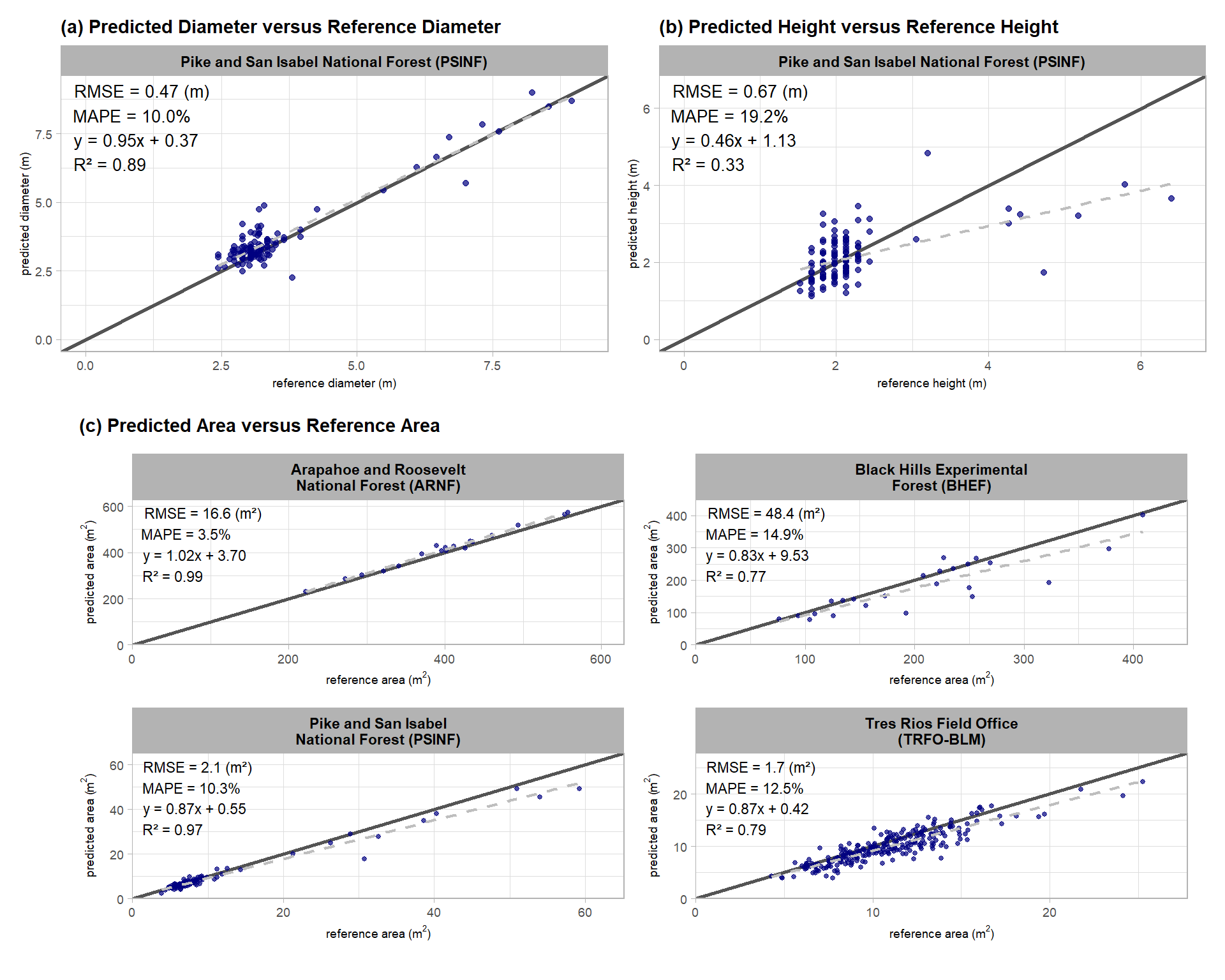
Based on the error metrics and this regression analysis, our slash pile quantification framework is highly accurate at capturing the horizontal dimensions of piles (area and diameter) but less accurate at capturing the height based on the PSINF field-measured values. The reduction in height accuracy compared to the diameter accuracy at this site is primarily driven by the tallest piles which our method provides height estimates well below the reference values. For shorter piles our method does not show a bias in representing pile height with most predicted values aligned with the reference values.
9.4 Height Accuracy Investigation
let’s dig into the discrepancy between the predicted and field-measured height values. way back in the point cloud processing section we noticed that the base of the pile was clearly visible within the DTM of the example pile footprint. This indicates that the lower portion of some piles may be incorrectly classified as ground by the CSF ground classification algorithm. Here, we’ll see if we can quantify “how much” of the pile height was included as ground instead of being attributed to the pile vertical dimension for the piles with the largest discrepancy between the predicted and reference height
we need to re-load the PSINF DTM raster
n_temp <- 8
psinf_dtm_rast <- terra::rast( file.path(psinf_out_dir, "dtm_0.25m.tif") )
psinf_dtm_rast
## class : SpatRaster
## size : 2193, 2780, 1 (nrow, ncol, nlyr)
## resolution : 0.25, 0.25 (x, y)
## extent : 499264, 499959, 4317599, 4318147 (xmin, xmax, ymin, ymax)
## coord. ref. : WGS 84 / UTM zone 13N (EPSG:32613)
## source : dtm_0.25m.tif
## name : 1_dtm_0.25m
## min value : 2683.782
## max value : 2724.683look at the 8 piles with the largest height under-prediction
# piles
htpiles_temp <-
  dbscan_gt_pred_match[["psinf"]] %>%
  dplyr::filter(match_grp=="true positive") %>%
  dplyr::mutate(diff_field_height_m = pred_height_m-field_height_m) %>%
  # dplyr::select(diff_field_height_m) %>% summary()
  dplyr::slice_min(n = n_temp, order_by = diff_field_height_m)
# htpiles_temp %>% dplyr::glimpse()
htpiles_temp %>%
  dplyr::select(pile_id, pred_height_m, field_height_m, diff_field_height_m, pct_diff_field_height_m) %>%
  dplyr::mutate(
    dplyr::across(tidyselect::starts_with("pct_"), ~scales::percent(.x, accuracy = 0.1))
    , dplyr::across(
      tidyselect::ends_with("_m") & !tidyselect::starts_with("pct_")
      , ~scales::comma(.x, accuracy = 0.01)
    )
  ) %>%
  kableExtra::kbl(
    caption = paste(n_temp, "piles with the largest height under-prediction")
    , col.names = c(
      "pile id"
      , "predicted ht. (m)"
      , "field ht. (m)"
      , "predicted<br>difference ht. (m)"
      , "predicted<br>% difference"
    )
    , escape = F
  ) %>%
kableExtra::kable_styling()| pile id | predicted ht. (m) | field ht. (m) |
predicted difference ht. (m) |
predicted % difference |
|---|---|---|---|---|
| 76 | 1.73 | 4.72 | -2.99 | 63.4% |
| 194 | 3.65 | 6.40 | -2.75 | 42.9% |
| 197 | 3.21 | 5.18 | -1.97 | 38.0% |
| 195 | 4.01 | 5.79 | -1.78 | 30.7% |
| 8 | 3.00 | 4.27 | -1.27 | 29.7% |
| 190 | 3.25 | 4.42 | -1.17 | 26.6% |
| 99 | 1.21 | 2.13 | -0.93 | 43.4% |
| 82 | 3.40 | 4.27 | -0.87 | 20.4% |
get the DTM within the pile footprints
# get DTM within footprint
dtm_temp <-
  htpiles_temp$pile_id %>%
  purrr::set_names() %>%
  purrr::map(function(x){
    dta_temp <- htpiles_temp %>% dplyr::filter(pile_id==x)
    buff_temp <- sqrt(dta_temp$gt_area_m2/pi)*0.3
    poly_temp <- slash_piles_polys[["psinf"]] %>% dplyr::filter(pile_id == x)
    dtm_temp <- psinf_dtm_rast %>%
      terra::crop(
        poly_temp %>%
          sf::st_buffer(buff_temp) %>%
          sf::st_transform(terra::crs(psinf_dtm_rast)) %>%
          terra::vect()
        , mask = T
      )
    # get area outside of pile
    ground_temp <- dtm_temp %>%
      terra::mask(
        poly_temp %>%
          sf::st_transform(terra::crs(psinf_dtm_rast)) %>%
          terra::vect()
        , inverse = T
      )
    return(list(
      dtm = dtm_temp
      , poly = poly_temp
      , ground = ground_temp
      , buffer = buff_temp
    ))
  })
# names(dtm_temp)
9.4.1 Estimate DTM inaccuracy
let’s use the DTM values in and around these pile footprints to:
- calculate a corrected ground level using DTM values just outside of the pile footprint based on a 30% buffer of the pile radius
- estimate the DTM over-prediction, which creates the under-prediction in pile heights, by subtracting the corrected ground level from the DTM values within the pile footprint to height correct the DTM. this height-corrected DTM within the pile footprint represents the DTM over-prediction and resulting CHM under-prediction
here’s an example
the DTM values just outside of the pile which should be ground
terra::plot(dtm_temp[[1]]$ground, axes = F)
terra::plot(terra::vect(dtm_temp[[1]]$poly), border = "cyan", col = NA, add = T)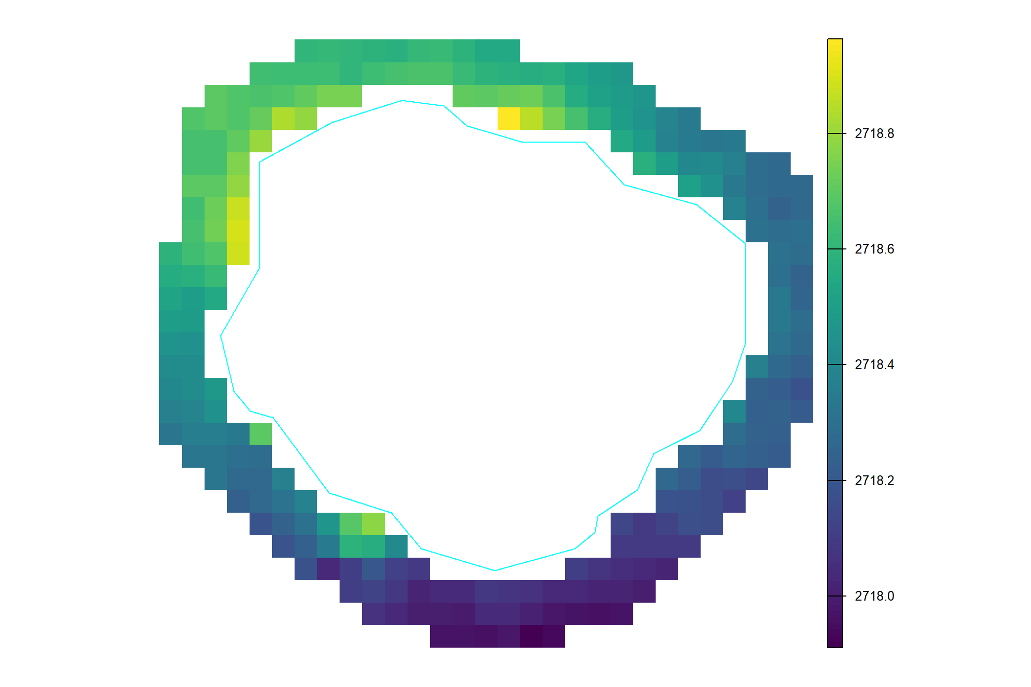
the mean of those values
## [1] "2,718.38"subtract the ground level (i.e. mean DTM outside of pile) from the DTM
(dtm_temp[[1]]$dtm-terra::global(dtm_temp[[1]]$ground, "mean", na.rm = T)[[1]]) %>%
  terra::clamp(lower = 0, values = T) %>%
  terra::mask(terra::vect(dtm_temp[[1]]$poly), updatevalue = 0) %>%
  terra::plot(axes=F)
terra::plot(terra::vect(dtm_temp[[1]]$poly), border = "cyan", col = NA, add = T)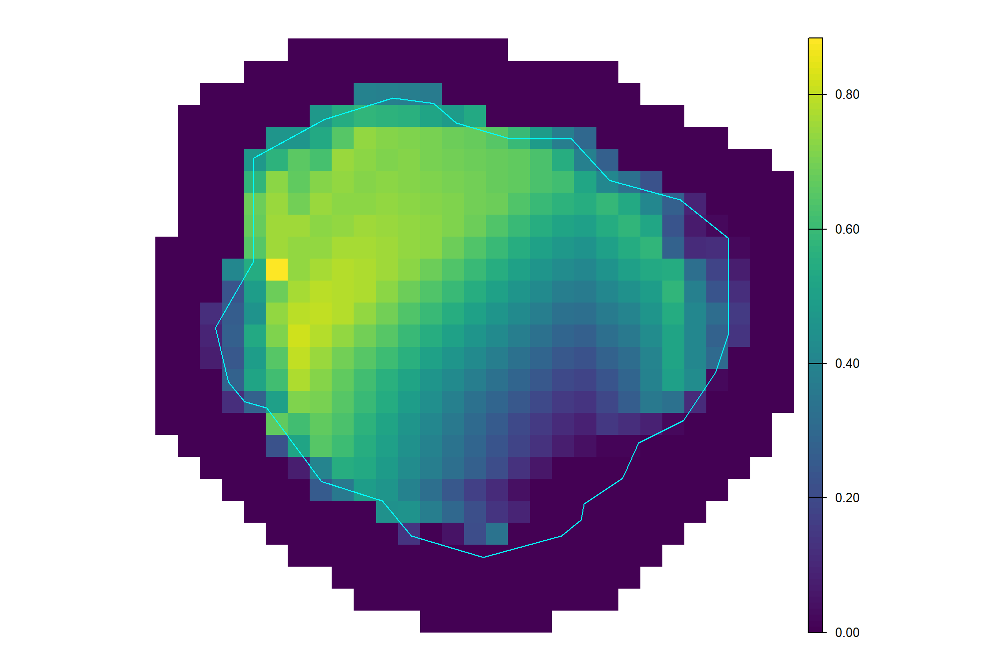
let’s do this for all 8 piles with the largest predicted height difference
# get DTM within footprint
htdiff_rast_temp <-
  dtm_temp %>%
  purrr::map(function(x){
    mean_ground <- terra::global(x$ground, "mean", na.rm = T)[[1]]
    norm <- (x$dtm-mean_ground) %>%
      terra::clamp(lower = 0, values = T) %>%
      terra::mask(terra::vect(x$poly), updatevalue = 0)
    huh <- exactextractr::exact_extract(x = norm, y = x$poly, fun = c("max", "mean"), force_df = T)
    return(list(
      dtm_norm = norm
      , poly = x$poly
      , df_sum = huh
    ))
  })
# names(htdiff_rast_temp)
# names(htdiff_rast_temp[[1]])
# terra::plot(htdiff_rast_temp[[2]]$dtm_norm)
# terra::plot(terra::vect(htdiff_rast_temp[[2]]$poly), border = "blue", col = NA, add = T)
# htdiff_rast_temp[[2]]$df_sum

# add the extracted summarized corrected DTM values to the pile data
htpiles_temp <-
  htdiff_rast_temp %>%
  purrr::map_dfr("df_sum", .id = "pile_id") %>%
  dplyr::rename(
    max_dtm_overpred_m = max
    , mean_dtm_overpred_m = mean
  ) %>%
  dplyr::mutate(pile_id = as.numeric(pile_id)) %>%
  dplyr::left_join(
    htpiles_temp
    , by = "pile_id"
  )
# htpiles_temp %>% dplyr::glimpse()
check out the corrected DTMs with the pile height underprediction compared to the maximum and mean DTM overprediction
plts_temp <-
  htdiff_rast_temp %>%
  purrr::imap(
    \(x,nm)
    ggplot2::ggplot() +
      ggplot2::geom_tile(
        data =
          x$dtm_norm %>%
            terra::as.data.frame(xy = T) %>%
            dplyr::rename(f=3)
        , ggplot2::aes(x=x,y=y,fill=f)
      ) +
      ggplot2::geom_sf(data = x$poly, fill = NA, color = "cyan", lwd = 1) +
      ggplot2::scale_x_continuous(expand = c(0, 0)) +
      ggplot2::scale_y_continuous(expand = c(0, 0)) +
      ggplot2::scale_fill_distiller(
        palette = "Oranges", direction=1
        , limits = c(
          0
          , max(c(
            htpiles_temp$max_dtm_overpred_m
            , htpiles_temp$mean_dtm_overpred_m
          ))
        )
      ) +
      ggplot2::labs(
        x = ""
        , y = ""
        , fill = "DTM\nbias (m)"
        , subtitle =
          paste0(
            "height underprediction: ", scales::comma(
              htpiles_temp %>%
                dplyr::filter(pile_id==as.numeric(nm)) %>%
                dplyr::pull(diff_field_height_m)
              , accuracy = 0.01, suffix = " m"
            )
            , "\nDTM maximum overprediction: ", scales::comma(x$df_sum$max, accuracy = 0.01, suffix = " m")
            , "\nDTM mean overprediction: ", scales::comma(x$df_sum$mean, accuracy = 0.01, suffix = " m")
          )
      ) +
      ggplot2::theme_void() +
      ggplot2::theme(
        legend.position = "bottom" # c(0.5,1)
        , legend.margin = ggplot2::margin(0,0,0,0)
        , legend.text = ggplot2::element_text(size = 8)
        , legend.title = ggplot2::element_text(size = 9)
        , legend.key = ggplot2::element_rect(fill = "white")
        # , plot.title = ggtext::element_markdown(size = 10, hjust = 0.5)
        , plot.title = ggplot2::element_text(size = 8.5, hjust = 0.5)
        , plot.subtitle = ggplot2::element_text(size = 8.5, hjust = 0.5)
        , plot.background = ggplot2::element_rect(fill = "gray93", color = "gray33")
      )
  )
# plts_temp[[8]]patchwork::wrap_plots(
c(plts_temp, list(patchwork::guide_area()))
, ncol = 3
# , guides = "collect"
) +
patchwork::plot_layout(guides = "collect")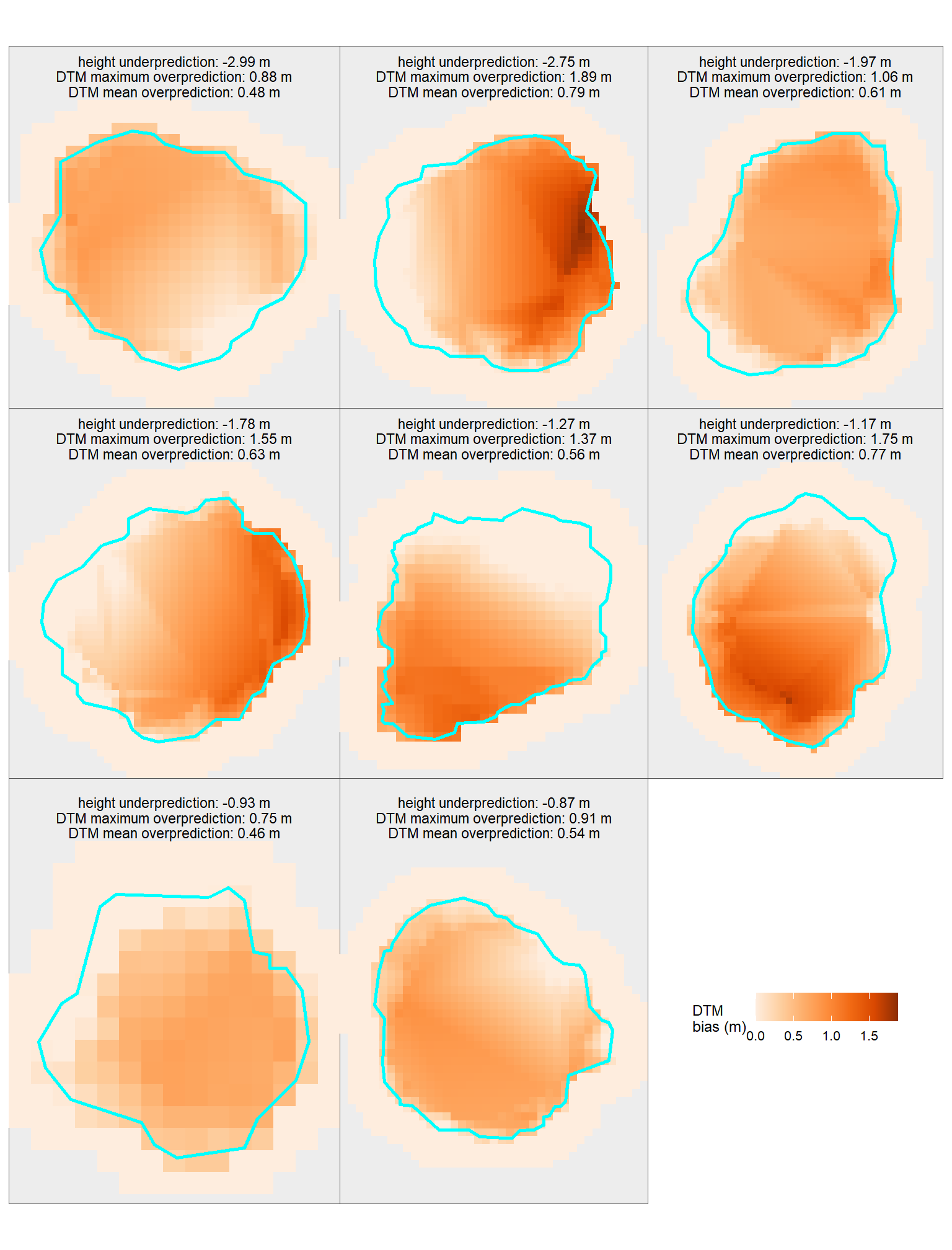
table the extracted maximum and mean DTM overprediction within each pile footprint and compare it to the predicted height underprediction
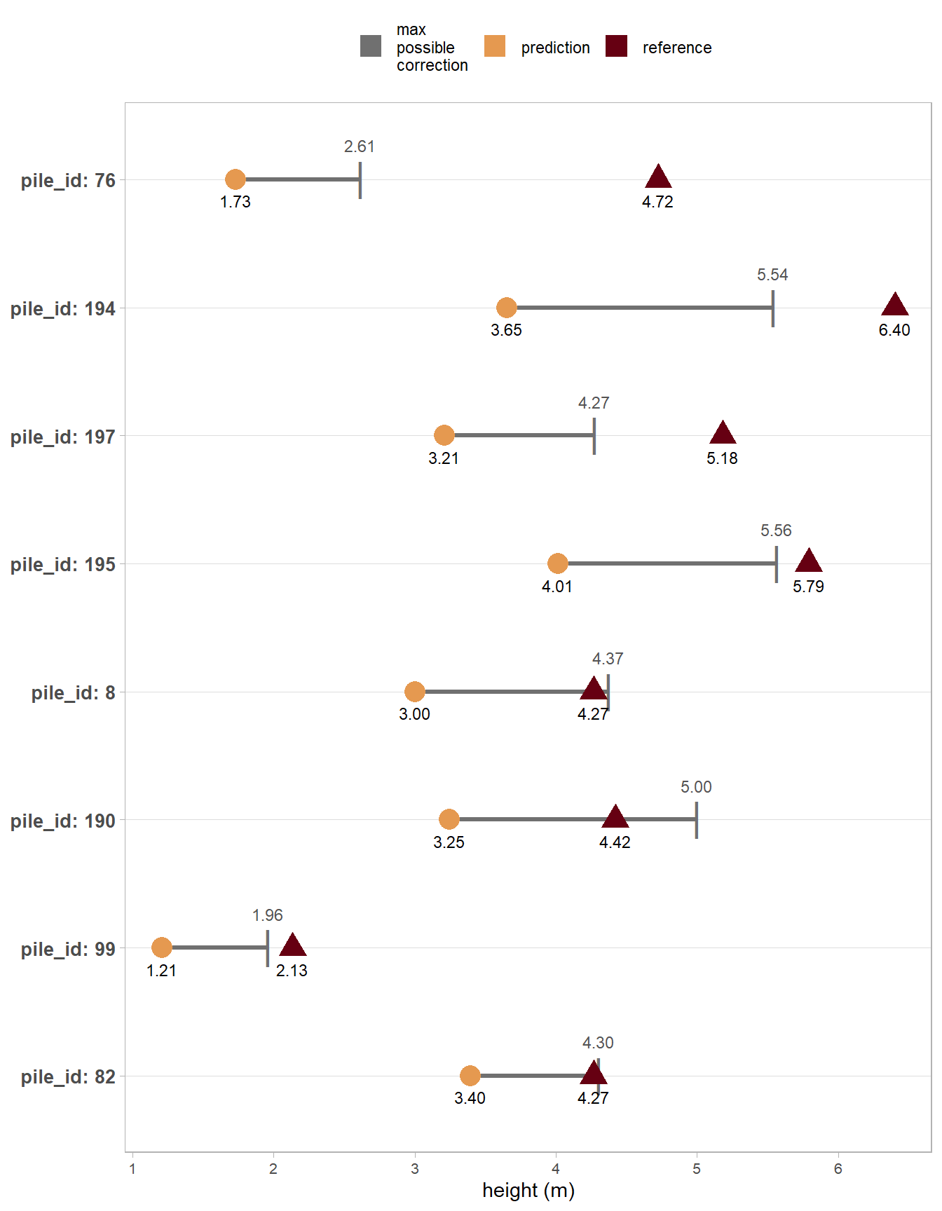
htpiles_temp %>%
  dplyr::select(pile_id, mean_dtm_overpred_m, max_dtm_overpred_m, diff_field_height_m) %>%
  dplyr::mutate(
    pct_correction = abs(max_dtm_overpred_m)/abs(diff_field_height_m)
    , max_corrected_diff_m = max_dtm_overpred_m+diff_field_height_m
  ) %>%
  dplyr::mutate(
    dplyr::across(tidyselect::starts_with("pct_"), ~scales::percent(.x, accuracy = 0.1))
    , dplyr::across(
      tidyselect::ends_with("_m") & !tidyselect::starts_with("pct_")
      , ~scales::comma(.x, accuracy = 0.01)
    )
  ) %>%
  kableExtra::kbl(
    caption = paste(n_temp, "piles with the largest height under-prediction", "<br>with maximum and mean DTM overprediction")
    , col.names = c(
      "pile id"
      , "mean<br>DTM bias (m)"
      , "max<br>DTM bias (m)"
      , "predicted<br>difference ht. (m)"
      , "max<br>% correction"
      , "max<br>possible corrected<br>difference ht. (m)"

    )
    , escape = F
  ) %>%
kableExtra::kable_styling()| pile id |
mean DTM bias (m) |
max DTM bias (m) |
predicted difference ht. (m) |
max % correction |
max possible corrected difference ht. (m) |
|---|---|---|---|---|---|
| 76 | 0.48 | 0.88 | -2.99 | 29.5% | -2.11 |
| 194 | 0.79 | 1.89 | -2.75 | 68.7% | -0.86 |
| 197 | 0.61 | 1.06 | -1.97 | 53.8% | -0.91 |
| 195 | 0.63 | 1.55 | -1.78 | 87.2% | -0.23 |
| 8 | 0.56 | 1.37 | -1.27 | 108.2% | 0.10 |
| 190 | 0.77 | 1.75 | -1.17 | 149.4% | 0.58 |
| 99 | 0.46 | 0.75 | -0.93 | 81.2% | -0.17 |
| 82 | 0.54 | 0.91 | -0.87 | 104.1% | 0.04 |
we can look at this graphically to see if the DTM overprediction offsets the predicted height difference
htpiles_temp %>% # dplyr::glimpse()
  dplyr::mutate(
    pile_id = factor(pile_id) %>%
      forcats::fct_reorder(diff_field_height_m) %>%
      forcats::fct_rev() %>%
      forcats::fct_relabel(~ paste0("pile_id: ", .x))
  ) %>%
  ggplot2::ggplot(mapping = ggplot2::aes(y = pile_id)) +
  # ggplot2::ggplot(mapping = ggplot2::aes(y = 0)) +
  ggplot2::geom_segment(mapping = ggplot2::aes(x = pred_height_m, xend = pred_height_m+max_dtm_overpred_m, color = "max\npossible\ncorrection"), lwd = 1.1) +
  ggplot2::geom_point(mapping = ggplot2::aes(x = pred_height_m+max_dtm_overpred_m, color = "max\npossible\ncorrection"), size = 7, shape = "|") +
  ggplot2::geom_point(mapping = ggplot2::aes(x = pred_height_m, color = "prediction"), size = 5, shape = 19) +
  ggplot2::geom_point(mapping = ggplot2::aes(x = field_height_m, color = "reference"), size = 5, shape = 17) +
  # labels
  ggplot2::geom_text(
    mapping = ggplot2::aes(
      x = pred_height_m+max_dtm_overpred_m
        # pred_height_m+(max_dtm_overpred_m/2)
      , label = scales::comma(pred_height_m+max_dtm_overpred_m, accuracy = 0.01)
    )
    , size = 3
    , hjust = 0.5, vjust = -2.2
    , color = "gray33"
  ) +
  ggplot2::geom_text(
    mapping = ggplot2::aes(x = pred_height_m, label = scales::comma(pred_height_m, accuracy = 0.01))
    , size = 3
    , hjust = 0.5, vjust = 2.2
  ) +
  ggplot2::geom_text(
    mapping = ggplot2::aes(x = field_height_m, label = scales::comma(field_height_m, accuracy = 0.01))
    , size = 3
    , hjust = 0.5, vjust = 2.2
  ) +
  # ggplot2::facet_wrap(facets = dplyr::vars(pile_id), scales = "free", axes = "all_x", strip.position = "left", ncol = 1) +
  ggplot2::scale_color_manual(
    values = c(
      "gray44"
      , rev(harrypotter::hp(n=2, option = "hermionegranger"))
    )
  ) +
  ggplot2::labs(
    x = "height (m)"
    , y = ""
    , color = ""
  ) +
  ggplot2::theme_light() +
  ggplot2::theme(
    legend.position = "top"
    , panel.grid.major.x = ggplot2::element_blank()
    , panel.grid.minor.x = ggplot2::element_blank()
    , axis.title.y = ggplot2::element_blank()
    , axis.text.y = ggplot2::element_text(size = 10, face = "bold")
    , axis.text.x = ggplot2::element_text(size = 8)
    # , strip.placement = "outside"
    # , axis.title.y = ggplot2::element_blank()
    # , strip.text.y.left = ggplot2::element_text(angle = 0)
  ) +
  ggplot2::guides(
    color = ggplot2::guide_legend(
      override.aes = list(shape = 15, size = 5, linetype = 0)
    )
  )
9.5 Volume Comparison
We excluded quantification accuracy metrics for derived volume because the resulting value would not constitute a true “error”. Comparing our predicted irregular CHM volume to a volume that was not directly measured, but instead calculated using a geometric assumption (like assuming a perfectly circular base and paraboloid shape) would be inappropriate. This is because any resulting difference between the prediction and the ground truth would be a blend of three inseparable factors: the error of the remote-sensing prediction method, the error in the direct field measurements (diameter/height), and the error introduced by the geometric shape assumption. Reporting such combined errors would be misleading, as it would be impossible to isolate the true performance of our remote-sensing method alone.
Instead, data involving derived values of volume based on field measurements and a shape assumption and its comparison to our irregularly shaped CHM-derived volume will be treated simply as data points for insight into the differences. Using geometric shape assumptions for estimating pile volume is the standard practice when implementing prescriptions or preparing for slash pile burning (Hardy 1996; Long & Boston 2014). This comparison will help us understand the discrepancy between our irregularly shaped CHM-derived volume and the volume calculated assuming a perfectly circular base and paraboloid shape with field-measured height and diameter. This approach will still provide valuable context about the impact of the perfectly circular base and paraboloid geometric assumptions without falsely attributing the error of the simplified model to the remote-sensing method itself.
let’s do that now
- field-measured piles
- volume assumes a paraboloid shape, with volume calculated using the field-measured diameter (as the width) and height. we’ll refer to this as “Reference Paraboloid Volume” to indicate the reference field measurement is derived using a shape assumption.
- predicted piles
- volume calculated from the elevation profile of the predicted irregular pile footprint, without assuming a specific geometric shape. we’ll refer to this as “Predicted Irregular CHM Volume” to indicate the predicted measurement is from our CHM-based detection methodology
We would generally expect that the reference paraboloid volume is larger than the predicted irregular CHM volume because the calculation assumes a perfectly regular geometric shape (circular base and paraboloid) based on maximum field dimensions (height and diameter). this process effectively encloses the actual, irregular pile form within a simplified geometric dome which inherently neglects and sits above the actual irregularities and voids in the pile structure, likely leading to an overestimation of the volume.
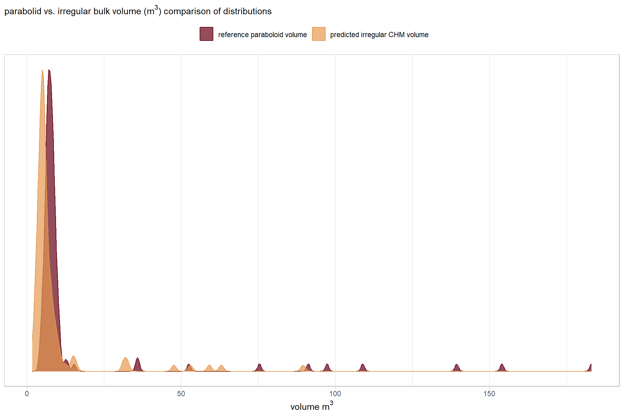
we already added volume measurements to the TP matches for both the ground truth and predicted piles, summary of that data
dbscan_gt_pred_match[["psinf"]] %>%
  dplyr::filter(match_grp=="true positive") %>%
  dplyr::select(field_volume_m3, pred_volume_m3) %>%
  summary()
## field_volume_m3 pred_volume_m3
## Min. : 4.270 Min. : 1.710
## 1st Qu.: 6.602 1st Qu.: 4.449
## Median : 7.536 Median : 5.346
## Mean : 15.403 Mean : 8.889
## 3rd Qu.: 8.777 3rd Qu.: 7.341
## Max. :183.080 Max. :89.497those don’t really look like they match up well…let’s explore
before we compare the volume measurements in aggregate, let’s look at the distributions
vol_df_temp <-
  dbscan_gt_pred_match[["psinf"]] %>%
  dplyr::filter(match_grp=="true positive") %>%
  dplyr::select(pile_id,field_volume_m3,pred_volume_m3) %>%
  tidyr::pivot_longer(cols = -c(pile_id)) %>%
  dplyr::mutate(
    name = factor(
      name
      , ordered = T
      , levels = c("field_volume_m3","pred_volume_m3")
      , labels = c(
        "reference paraboloid volume"
        , "predicted irregular CHM volume"
      )
    )
  )
# plot dist
vol_df_temp %>%
  ggplot2::ggplot(mapping = ggplot2::aes(x = value, color = name, fill = name)) +
  ggplot2::geom_density(mapping = ggplot2::aes(y=ggplot2::after_stat(scaled)), alpha = 0.7) +
  harrypotter::scale_color_hp_d(option = "hermionegranger") +
  harrypotter::scale_fill_hp_d(option = "hermionegranger") +
  ggplot2::scale_y_continuous(NULL,breaks=NULL) +
  ggplot2::labs(
    color="",fill="",x=latex2exp::TeX("volume $m^3$")
    , subtitle = latex2exp::TeX("parabolid vs. irregular bulk volume ($m^3$) comparison of distributions")
  ) +
  ggplot2::theme_light() +
  ggplot2::theme(
    legend.position = "top"
  )
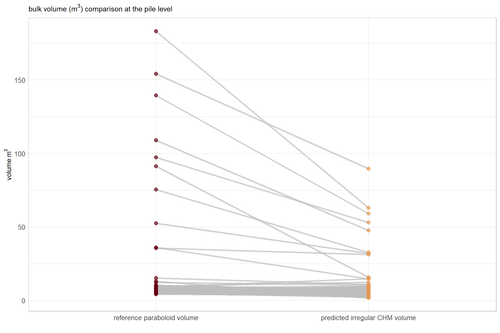
slope plots are neat too
vol_df_temp %>%
  ggplot2::ggplot(
    mapping = ggplot2::aes(x = name, y = value, group = pile_id)
  ) +
  ggplot2::geom_line(key_glyph = "point", alpha = 0.7, color = "gray", lwd = 1.1) +
  ggplot2::geom_point(mapping = ggplot2::aes(color = name), alpha = 0.7, size = 2.5) +
  harrypotter::scale_color_hp_d(option = "hermionegranger") +
  ggplot2::labs(
    color=""
    , y = latex2exp::TeX("volume $m^3$")
    , x = ""
    , subtitle = latex2exp::TeX("bulk volume ($m^3$) comparison at the pile level")
  ) +
  ggplot2::theme_light() +
  ggplot2::theme(
    legend.position = "none"
    , axis.title = ggplot2::element_text(size = 10)
    , axis.text = ggplot2::element_text(size = 10)
  )
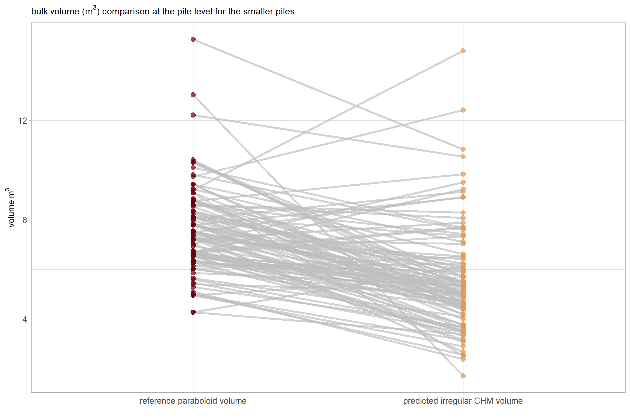
what if we only look at the smaller piles?
vol_df_temp %>%
  dplyr::ungroup() %>%
  dplyr::mutate(x = value < quantile(vol_df_temp$value, probs = 0.90)) %>%
  dplyr::group_by(pile_id) %>%
  dplyr::filter(
    max(x) == 1
  ) %>%
  ggplot2::ggplot(
    mapping = ggplot2::aes(x = name, y = value, group = pile_id)
  ) +
  ggplot2::geom_line(key_glyph = "point", alpha = 0.7, color = "gray", lwd = 1.1) +
  ggplot2::geom_point(mapping = ggplot2::aes(color = name), alpha = 0.7, size = 2.5) +
  harrypotter::scale_color_hp_d(option = "hermionegranger") +
  ggplot2::labs(
    color=""
    , y = latex2exp::TeX("volume $m^3$")
    , x = ""
    , subtitle = latex2exp::TeX("bulk volume ($m^3$) comparison at the pile level for the smaller piles")
  ) +
  ggplot2::theme_light() +
  ggplot2::theme(
    legend.position = "none"
    , axis.title = ggplot2::element_text(size = 10)
    , axis.text = ggplot2::element_text(size = 10)
  )
let’s compare aggregated volume measurements for the true positive matches
Mean Difference (MD): \[\text{MD} = \frac{1}{N} \sum_{i=1}^{N} (\text{Reference Paraboloid Volume}_i - \text{Predicted Volume}_i)\]
Percent Mean Difference: \[\%\text{MD} = \frac{\text{MD}}{\text{Mean}(\text{Predicted Volume})} \times 100\]
vol_agg_df_temp <-
  dbscan_gt_pred_match[["psinf"]] %>%
  dplyr::filter(match_grp=="true positive") %>%
  dplyr::ungroup() %>%
  dplyr::summarise(
    mean_diff = mean(field_volume_m3-pred_volume_m3)
    , sd_diff = sd(field_volume_m3-pred_volume_m3)
    , mean_field_volume_m3 = mean(field_volume_m3,na.rm = T)
    , mean_pred_volume_m3 = mean(pred_volume_m3,na.rm = T)
  ) %>%
  dplyr::mutate(
    pct_mean_diff = mean_diff/mean_pred_volume_m3
  )
what did we get?
vol_agg_df_temp %>%
  tidyr::pivot_longer(dplyr::everything()) %>%
  dplyr::mutate(
    value =
      dplyr::case_when(
        stringr::str_starts(name, "pct_") ~ scales::percent(value, accuracy = 0.1)
        , T ~ scales::comma(value, accuracy = 0.1)
      )
  ) %>%
  kableExtra::kbl(
    caption = "comparison of aggregated reference paraboloid volume and predicted irregular CHM volume"
    , col.names = c("metric", "value")
  ) %>%
kableExtra::kable_styling()| metric | value |
|---|---|
| mean_diff | 6.5 |
| sd_diff | 17.6 |
| mean_field_volume_m3 | 15.4 |
| mean_pred_volume_m3 | 8.9 |
| pct_mean_diff | 73.3% |
we’ll dig into the MD shortly but before we move on let’s focus on the percent mean difference. We calcualted a %MD of 73.3% which indicates a major systematic difference where the reference paraboloid volume is, on average, 73.3% larger than our CHM-predicted irregular CHM volume. This large relative difference shows how much the geometric assumptions inflate the volume compared to the irregular volumes measured by our remote sensing-based method.
let’s make a Bland-Altman plot to compare the two measurement methods. this plot uses the average of the two measurements (approximate size) on the x-axis and the difference (bias) between the two measurements on the y-axis
dbscan_gt_pred_match[["psinf"]] %>%
  dplyr::filter(match_grp=="true positive") %>%
  dplyr::ungroup() %>%
  # calc needed metrics
  dplyr::mutate(
    mean_vol = (field_volume_m3+pred_volume_m3)/2
    , diff_vol = (field_volume_m3-pred_volume_m3) # match the order used in vol_agg_df_temp
    , scale_diff = ifelse(diff_vol < 0, -abs(diff_vol) / abs(min(diff_vol)), diff_vol / max(diff_vol))
  ) %>%
  # ggplot() + geom_point(aes(x=diff_vol,y=0, color=scale_diff)) + scale_color_gradient2(mid = "gray", midpoint = 0, low = "red", high = "blue")
  # plot
  ggplot2::ggplot(
    mapping = ggplot2::aes(x = mean_vol, y = diff_vol)
  ) +
  ggplot2::geom_hline(yintercept = 0, color = "black", lwd = 1.2) +
  # mean difference (bias)
  ggplot2::geom_hline(
    yintercept = vol_agg_df_temp$mean_diff
    , linetype = "dashed", color = "blue", lwd = 1
  ) +
  # upper limit
  ggplot2::geom_hline(
    yintercept = vol_agg_df_temp$mean_diff+1.96*vol_agg_df_temp$sd_diff
    , linetype = "dotted", color = "red", lwd = 1
  ) +
  # lower limit
  ggplot2::geom_hline(
    yintercept = vol_agg_df_temp$mean_diff-1.96*vol_agg_df_temp$sd_diff
    , linetype = "dotted", color = "red", lwd = 1
  ) +
  # annotations
  ggplot2::annotate(
    "text"
    , x = Inf
    , y = vol_agg_df_temp$mean_diff
    , label = latex2exp::TeX(
      paste0(
        "mean difference (bias): "
        , scales::comma(vol_agg_df_temp$mean_diff, accuracy = 0.01)
        , " $m^3$"
      )
      , output = "character"
    )
    , vjust = -0.5
    , hjust = 1
    , color = "blue"
    , size = 4
    , parse = TRUE
  ) +
  ggplot2::annotate(
    "text"
    , x = Inf
    , y = vol_agg_df_temp$mean_diff+1.96*vol_agg_df_temp$sd_diff
    , label = latex2exp::TeX(
      paste0(
        "+1.96 SD: "
        , scales::comma(vol_agg_df_temp$mean_diff+1.96*vol_agg_df_temp$sd_diff, accuracy = 0.01)
        , " $m^3$"
      )
      , output = "character"
    )
    , vjust = -0.5
    , hjust = 1
    , color = "red"
    , size = 4
    , parse = TRUE
  ) +
  ggplot2::annotate(
    "text"
    , x = Inf
    , y = vol_agg_df_temp$mean_diff-1.96*vol_agg_df_temp$sd_diff
    , label = latex2exp::TeX(
      paste0(
        "-1.96 SD: "
        , scales::comma(vol_agg_df_temp$mean_diff-1.96*vol_agg_df_temp$sd_diff, accuracy = 0.01)
        , " $m^3$"
      )
      , output = "character"
    )
    , vjust = 1.5
    , hjust = 1
    , color = "red"
    , size = 4
    , parse = TRUE
  ) +
  # points
  ggplot2::geom_point(mapping = ggplot2::aes(color = scale_diff), size = 1.9, alpha = 0.8) +
  ggplot2::scale_color_steps2(mid = "gray", midpoint = 0) +
  ggplot2::labs(
    subtitle = "Bland-Altman plot: reference paraboloid volume vs predicted irregular CHM volume"
    , x = latex2exp::TeX("mean volume ($m^3$)")
    , y = latex2exp::TeX("difference (allometric - predicted irregular CHM volume $m^3$)")
  ) +
  ggplot2::theme_light() +
  ggplot2::theme(legend.position = "none")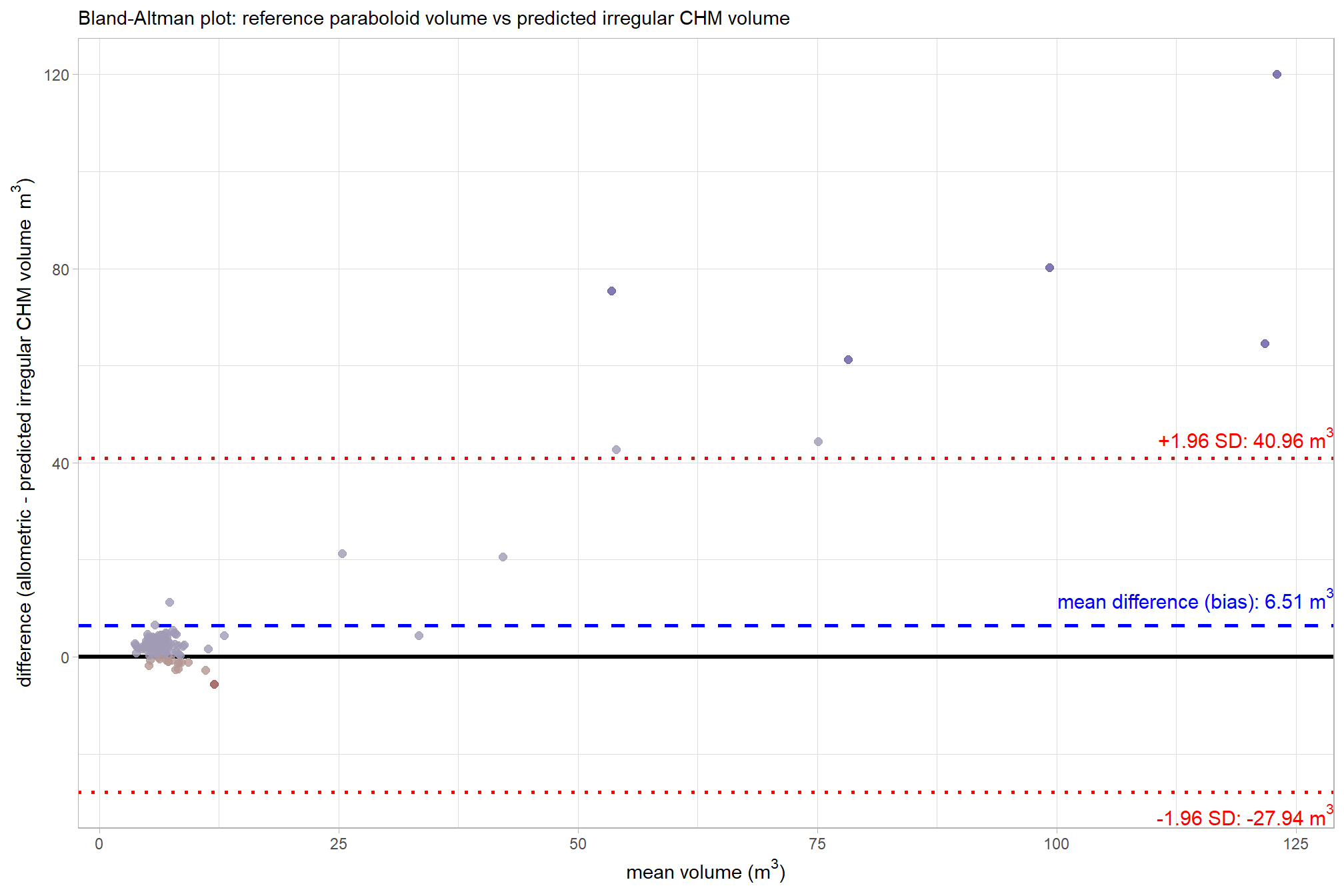
That’s a lot of plotting to show that the mean difference is 6.51 m3. Points falling outside the 95% interval on the plot are instances of significant disagreement between the two volume measurements for those specific data points. These outliers indicate that, for a particular pile, the difference between the reference paraboloid volume and the predicted irregular CHM volume is unusually large, suggesting a potential failure in either the CHM segmentation process, the quality of the original field measurements, the geometric shape assumption, or a combination thereof. We should investigate these extreme disagreements further to see what is happening
before we do that, let’s use a paired t-test to determine if the mean difference (MD) between the reference paraboloid volume and the predicted irregular CHM volume is statistically significant (i.e. significantly different from zero)
# is the mean difference between the two volumes significantly different from zero
ttest1 <- t.test(
  dbscan_gt_pred_match[["psinf"]] %>%
    dplyr::filter(match_grp == "true positive") %>%
    dplyr::pull(field_volume_m3)
  , dbscan_gt_pred_match[["psinf"]] %>%
    dplyr::filter(match_grp == "true positive") %>%
    dplyr::pull(pred_volume_m3)
  , paired = TRUE
)
ttest1
##
## Paired t-test
##
## data: dbscan_gt_pred_match[["psinf"]] %>% dplyr::filter(match_grp == "true positive") %>% dplyr::pull(field_volume_m3) and dbscan_gt_pred_match[["psinf"]] %>% dplyr::filter(match_grp == "true positive") %>% dplyr::pull(pred_volume_m3)
## t = 3.9741, df = 114, p-value = 0.0001243
## alternative hypothesis: true mean difference is not equal to 0
## 95 percent confidence interval:
## 3.266685 9.760398
## sample estimates:
## mean difference
## 6.513542that’s neat, the test gave us the same mean difference (MD) of 6.51 m3 that we calculated above. also, the p-value of 0.00012 is less than 0.05, meaning we should reject the null hypothesis that the true mean difference is zero. this confirms that the systematic difference (or bias) we observed where allometric volume is larger than our predicted irregular CHM volume is statistically significant and not due to random chance.
9.5.1 Irregular vs. Paraboloid: Comparison of Individual Piles
# # get prediction for r2
lm_temp <- lm(
  pred_volume_m3 ~ field_volume_m3
  , data =
    dbscan_gt_pred_match[["psinf"]] %>%
    dplyr::filter(match_grp=="true positive")
)
# summary(lm_temp)
# scales::percent(summary(lm_temp)$r.squared, accuracy = 0.1)
# summary(lm_temp) %>% names()
lmf_temp <- paste0(
  "y = "
  , scales::number(summary(lm_temp)$coefficients[2,1], accuracy = 0.01) #slope
  , "x"
  , ifelse(summary(lm_temp)$coefficients[1,1]<0," - ", " + ")
  , scales::number(abs(summary(lm_temp)$coefficients[1,1]), accuracy = 0.01) #intercept
)

volume_comp_scatter1 <-
  dbscan_gt_pred_match[["psinf"]] %>%
  dplyr::filter(match_grp=="true positive") %>%
  dplyr::bind_cols(
    all_stand_boundary %>%
      sf::st_drop_geometry() %>%
      dplyr::filter(site_data_lab=="psinf") %>%
      dplyr::select(site_data_lab, site_full_lab)
  ) %>%
  ggplot2::ggplot(mapping = ggplot2::aes(y = pred_volume_m3, x = field_volume_m3)) +
  ggplot2::geom_abline(color = "gray33", lwd = 1) +
  ggplot2::geom_point(color = "navy", alpha = 0.7, size = 2) +
  ggplot2::geom_smooth(lwd = 0.8, method = "lm", se=F, color = "gray", linetype = "dashed") +
  ggplot2::annotate(
    "text",
    x = -Inf, y = Inf # Top Left
    , label =
      # paste0(
      #   "R^2 == "
      #   , scales::number((summary(lm_temp)$r.squared)*100, accuracy = 0.1)
      #   , "*'%'"
      # )
      paste0(
        "MD = "
        , scales::comma(ttest1$estimate, accuracy = 0.01, suffix = " (m³)")
        , "\n"
        , lmf_temp
        , "\n R² = "
        # , scales::number((summary(lm_temp)$r.squared)*100, accuracy = 0.1, suffix = "%")
        , scales::number((summary(lm_temp)$r.squared), accuracy = 0.01)
      )
    , hjust = -0.1, vjust = 1.1
    , parse = F
    , size = 3.5
  ) +
  ggplot2::scale_x_continuous(limits = c(0, max( max(dbscan_gt_pred_match[["psinf"]]$pred_volume_m3,na.rm=T), max(dbscan_gt_pred_match[["psinf"]]$field_volume_m3,na.rm=T) )*1.02 )) +
  ggplot2::scale_y_continuous(limits = c(0, max( max(dbscan_gt_pred_match[["psinf"]]$pred_volume_m3,na.rm=T), max(dbscan_gt_pred_match[["psinf"]]$field_volume_m3,na.rm=T) )*1.02 )) +
  ggplot2::facet_wrap(facets = dplyr::vars(site_full_lab), scales = "free", axis.labels = "all") +
  ggplot2::labs(
    x = latex2exp::TeX("reference paraboloid volume $m^3$")
    , y = latex2exp::TeX("predicted irregular CHM volume $m^3$")
    # , subtitle = latex2exp::TeX("bulk volume ($m^3$) comparison")
    , subtitle = "(a) Predicted Irregular CHM versus Reference Paraboloid Volume"
  ) +
  ggplot2::theme_light() +
  ggplot2::theme(
    plot.subtitle = ggplot2::element_text(face = "bold")
    , strip.text = ggplot2::element_text(face = "bold", color = "black")
  )
volume_comp_scatter1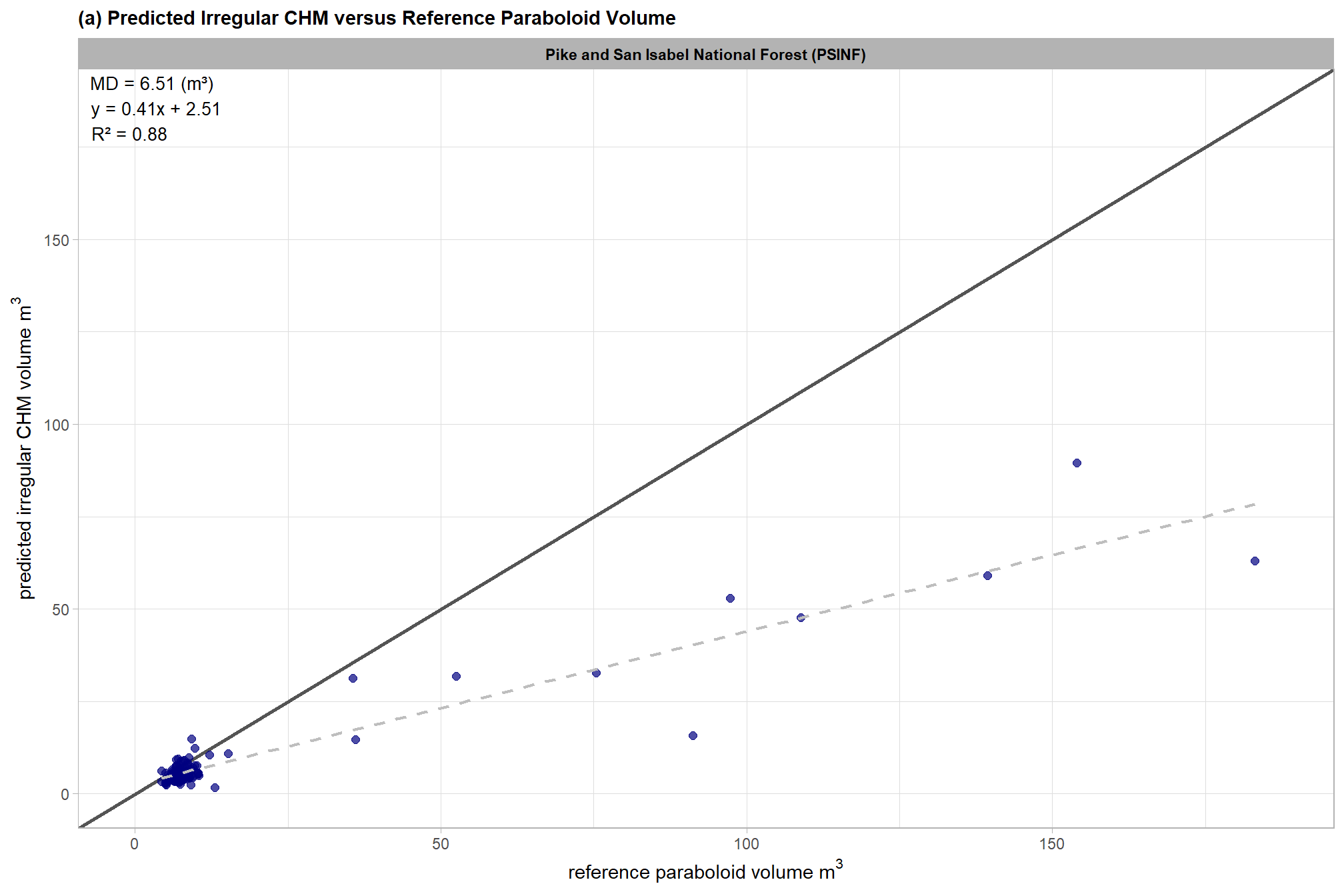
this is exactly what we expected: for true positive matches, there is a clear systematic difference with the plot showing that the volume calculated using the idealized, regular shape assumption (reference paraboloid volume) is consistently larger than the predicted irregular CHM volume derived from the CHM
let’s check these using lm()
##
## Call:
## lm(formula = pred_volume_m3 ~ field_volume_m3, data = dbscan_gt_pred_match[["psinf"]] %>%
##     dplyr::filter(match_grp == "true positive"))
##
## Residuals:
##      Min       1Q   Median       3Q      Max
## -24.4818  -1.4631  -0.3515   0.9946  23.1725
##
## Coefficients:
##                 Estimate Std. Error t value Pr(>|t|)
## (Intercept)      2.50727    0.46133   5.435  3.2e-07 ***
## field_volume_m3  0.41433    0.01407  29.453  < 2e-16 ***
## ---
## Signif. codes:  0 '***' 0.001 '**' 0.01 '*' 0.05 '.' 0.1 ' ' 1
##
## Residual standard error: 4.368 on 113 degrees of freedom
## Multiple R-squared:  0.8847, Adjusted R-squared:  0.8837
## F-statistic: 867.5 on 1 and 113 DF,  p-value: < 2.2e-16
These linear model results (intercept = 2.51, slope = 0.41) indicate a strong proportional bias that significantly increases with pile size. The low slope (0.41) coupled with the positive intercept (2.51) indicate that the volume difference is not a simple constant offset (e.g. slope of ~1.0 and intercept of <0 if our hypothesis of consistently higher reference paraboloid volume is true), but rather a scaling issue that is driven by the largest piles. The much larger reference paraboloid volume estimates relative to the CHM-predicted irregular CHM volumes for the largest piles exert a strong influence on the predicted form of the liner model, pulling the slope steeply downward and forcing the intercept above zero as a mathematical artifact. Despite the predicted positive intercept, visual inspection of the data shows that most reference paraboloid volumes are larger than the CHM-predicted irregular CHM volumes, even for smaller piles. The slope value indicates that for every 1 m3 increase in reference paraboloid volume, the predicted irregular volume volume increases by nearly 0.41 m3. This data suggests that the geometric assumptions of the paraboloid model potentially introduce substantial scaling error which may limit its reliability (especially for larger piles) for accurately estimating the volume of real-world piles which have heterogeneous footprints and elevation profiles.
9.5.2 Extreme Volume Disagreements
let’s investigate the extreme disagreements further to see what is happening
bad_vol_df_temp <-
  dbscan_gt_pred_match[["psinf"]] %>%
  dplyr::filter(match_grp=="true positive") %>%
  dplyr::ungroup() %>%
  # calc needed metrics
  dplyr::mutate(
    diff_vol = (field_volume_m3-pred_volume_m3) # match the order used in vol_agg_df_temp
  ) %>%
  dplyr::filter(
    diff_vol < (vol_agg_df_temp$mean_diff-1.96*vol_agg_df_temp$sd_diff)
    | diff_vol > (vol_agg_df_temp$mean_diff+1.96*vol_agg_df_temp$sd_diff)
  ) %>%
  dplyr::left_join(
    slash_piles_polys[["psinf"]] %>%
      sf::st_drop_geometry() %>%
      dplyr::select(pile_id, comment) %>%
      dplyr::rename(pile_type = comment)
    , by = "pile_id"
  )
# what are the differences?
bad_vol_df_temp %>%
  dplyr::select(
    pile_id, pile_type
    , field_height_m, pred_height_m, diff_field_height_m
    , field_diameter_m, pred_diameter_m, diff_field_diameter_m
    , field_volume_m3, pred_volume_m3
  ) %>%
  dplyr::mutate(
    dplyr::across(
      .cols = -c(pile_id,pile_type)
      , .fns = ~ scales::comma(.x,accuracy=0.01)
    )
  ) %>%
  kableExtra::kbl(
    caption = "Volume measurement outliers: comparison of ground truth and predicted piles"
    # , col.names = c("metric", "value")
  ) %>%
kableExtra::kable_styling(font_size = 9.8)| pile_id | pile_type | field_height_m | pred_height_m | diff_field_height_m | field_diameter_m | pred_diameter_m | diff_field_diameter_m | field_volume_m3 | pred_volume_m3 |
|---|---|---|---|---|---|---|---|---|---|
| 190 | Mechanical Pile | 4.42 | 3.25 | -1.17 | 8.96 | 8.68 | -0.28 | 139.37 | 59.11 |
| 194 | Mechanical Pile | 6.40 | 3.65 | -2.75 | 8.53 | 8.48 | -0.06 | 183.08 | 62.97 |
| 195 | Mechanical Pile | 5.79 | 4.01 | -1.78 | 8.23 | 8.99 | 0.76 | 154.02 | 89.50 |
| 82 | Mechanical Pile | 4.27 | 3.40 | -0.87 | 7.62 | 7.56 | -0.06 | 97.30 | 52.95 |
| 197 | Mechanical Pile | 5.18 | 3.21 | -1.97 | 7.32 | 7.84 | 0.53 | 108.89 | 47.61 |
| 8 | Mechanical Pile | 4.27 | 3.00 | -1.27 | 6.71 | 7.38 | 0.67 | 75.35 | 32.67 |
| 76 | Mechanical Pile | 4.72 | 1.73 | -2.99 | 7.01 | 5.68 | -1.33 | 91.18 | 15.80 |
All of the extreme volume discrepancies at the PSINF site occur for mechanical piles, where field-measured heights exceed the predicted, CHM-derived heights. One possible cause of this height discrepancy is that the max_ht_m parameter was set too low to capture the upper extent of these taller structures. If this is the case, then the predicted height would be right at the maximum height allowed by max_ht_m. However, we set the max_ht_m parameter to 5.0 m and the maximum predicted height of these piles was 4.0 m which means that it is not likely that the height-filtered CHM removed the top of the pile from the unfiltered CHM.
Instead, the under-prediction appears to stem from artifacts in height normalization during point cloud processing. If we go back to look at the DTM of this site we can see slight vertical variations within the pile footprints, suggesting that the ground classification algorithm incorrectly identified the lower portions of these larger piles as terrain. Because the DTM was incorrectly inflated within the pile footprint the height-normalized CHM slightly underestimates the true height of the piles.
bad_vol_df_temp %>%
  dplyr::select(
    pile_id
    , field_height_m, pred_height_m
    , field_diameter_m, pred_diameter_m
    , field_volume_m3, pred_volume_m3
  ) %>%
  tidyr::pivot_longer(
    cols = -c(pile_id)
    , names_to = "metric"
    , values_to = "value"
  ) %>%
  dplyr::mutate(
    which_data = dplyr::case_when(
        stringr::str_starts(metric,"field_") ~ "field"
        , stringr::str_starts(metric,"pred_") ~ "prediction"
        , T ~ "error"
      ) %>%
      ordered()
    , pile_metric = metric %>%
      stringr::str_remove("(_rmse|_rrmse|_mean|_mape)$") %>%
      stringr::str_extract("(paraboloid_volume|volume|area|height|diameter)") %>%
      factor(
        ordered = T
        , levels = c(
          "volume"
          , "area"
          , "height"
          , "diameter"
        )
        , labels = c(
          "Volume (m3)"
          , "Area (m2)"
          , "Height (m)"
          , "Diameter (m)"
        )
      )
  ) %>%
  ggplot2::ggplot(
    mapping = ggplot2::aes(x = which_data, y = value, label = scales::comma(value,accuracy=0.1), group = pile_id)
  ) +
  ggplot2::geom_line(key_glyph = "point", alpha = 0.7, color = "gray", lwd = 1.1) +
  ggplot2::geom_point(mapping = ggplot2::aes(color = which_data), alpha = 0.8, size = 2.5) +
  harrypotter::scale_color_hp_d(option = "hermionegranger") +
  # harrypotter::scale_fill_hp_d(option = "hermionegranger") +
  ggplot2::geom_text(
    vjust = -0.25
    , show.legend = FALSE
  ) +
  ggplot2::facet_grid(rows = dplyr::vars(pile_metric), scales = "free_y") +
  ggplot2::scale_y_continuous(labels = scales::comma, expand = ggplot2::expansion(mult = c(0.05,.32))) +
  ggplot2::labs(
    x = "", y = "", color = ""
    , subtitle = "Volume measurement outliers: comparison of measurements"
  ) +
  ggplot2::theme_light() +
  ggplot2::theme(
    legend.position = "none"
    , strip.text = ggplot2::element_text(size = 11, color = "black", face = "bold")
) 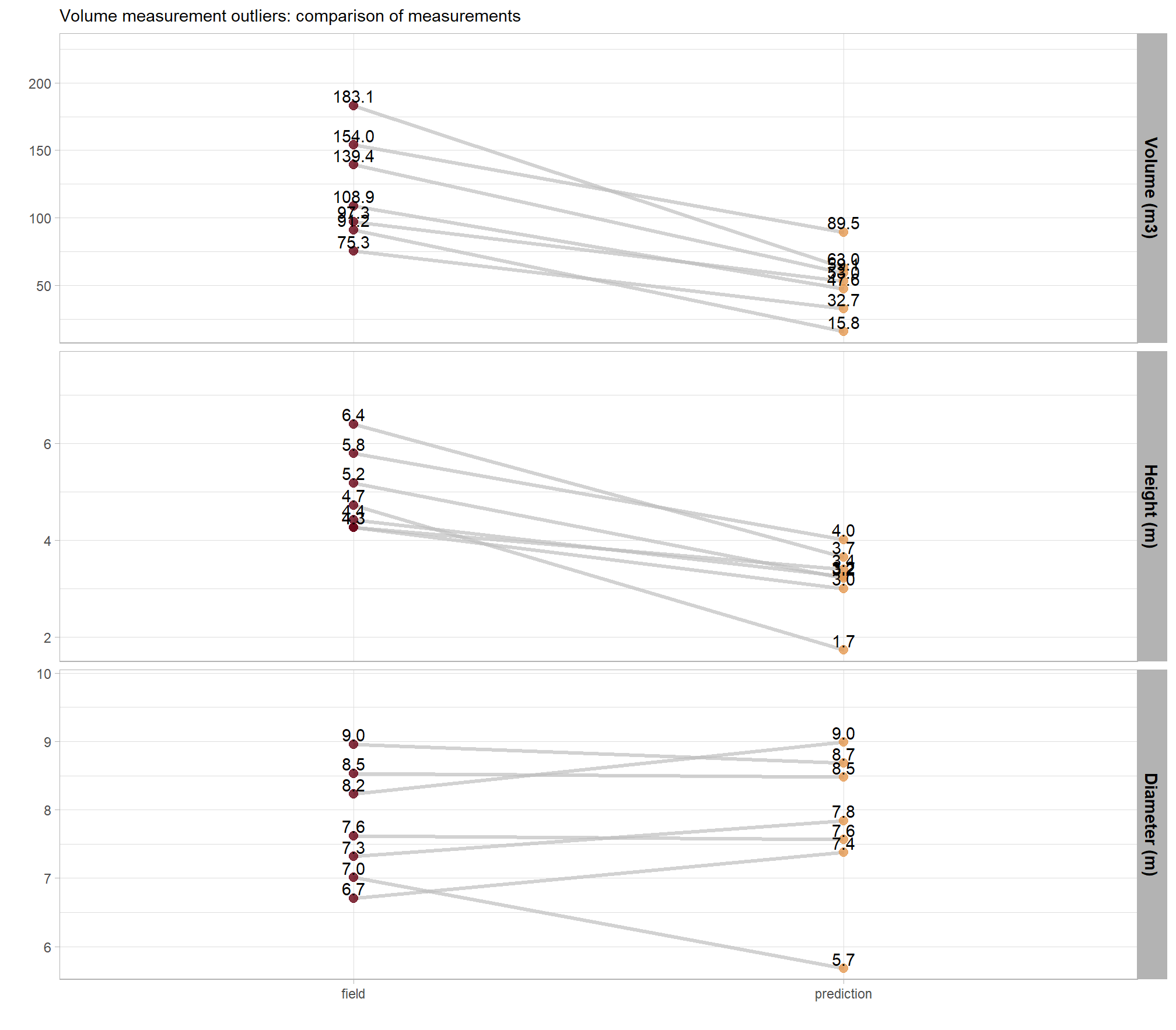
RGB with the predicted piles (magenta) and the ground-truth piles (cyan) overlaid with the CHM
# cloud2raster_ans$chm_rast %>%
#   terra::clamp(upper = structural_params_settings$max_ht_m, lower = 0, values = F) %>%
#   terra::plot()
# bad_vol_df_temp %>% dplyr::glimpse()
# plot RGB + CHM
# plot RGB
plts_temp <-
  1:nrow(bad_vol_df_temp) %>%
  # sample(1) %>%
  purrr::map(function(x){
    dta <- bad_vol_df_temp %>% dplyr::slice(x)
    gt <- slash_piles_polys[["psinf"]] %>% dplyr::filter(pile_id==dta$pile_id)
    pr <- dbscan_spectral_preds[["psinf"]] %>% dplyr::filter(pred_id==dta$pred_id)
    #plt
    ortho_plt_fn(
      rgb_rast = rgb_rast[["psinf"]]
      , stand = gt
      , add_stand = F
      , buffer = 7
    ) +
      ggnewscale::new_scale_fill() +
      ggplot2::geom_tile(
        data = chm_rast[["psinf"]] %>%
          terra::crop(
            sf::st_union(gt,pr) %>%
              sf::st_transform(terra::crs(chm_rast[["psinf"]])) %>%
              terra::vect()
            , mask = T
          ) %>%
          terra::as.data.frame(xy=T) %>%
          dplyr::rename(f=3)
        , mapping = ggplot2::aes(x=x,y=y,fill=f)
        , alpha = 0.5
        , inherit.aes = F
        , show.legend = T
      ) +
      ggplot2::scale_fill_viridis_c(
        option = "plasma", na.value = "gray",name = "CHM (m)"
        , limits = c(0,all_stand_boundary %>% dplyr::filter(site_data_lab=="psinf") %>% dplyr::pull(max_ht_m))
      ) +
      ggplot2::geom_sf(data = gt, fill = NA, color = "cyan", lwd = 0.6) +
      ggplot2::geom_sf(data = pr, fill = NA, color = "magenta", lwd = 0.5) +
      ggplot2::labs(
        subtitle = paste0(
          "Fld ht: ", round(dta$field_height_m,1)
          , " | Pred ht: ", round(dta$pred_height_m,1)
          , "\nFld dia: ", round(dta$field_diameter_m,1)
          , " | Pred dia: ", round(dta$pred_diameter_m,1)
        )
      ) +
      ggplot2::theme(
        legend.position = "bottom"
        , legend.text = ggplot2::element_text(size = 8)
        , legend.title = ggplot2::element_text(size = 8)
      )
  })
# plts_temp
# combine
patchwork::wrap_plots(
  plts_temp
  , ncol = 3
  , guides = "collect"
) +
patchwork::plot_annotation(
  theme = ggplot2::theme(
    legend.position = "bottom"
    , legend.text = ggplot2::element_text(size = 8)
    , legend.title = ggplot2::element_text(size = 8)
    , legend.margin = ggplot2::margin(0,0,0,0)
  )
)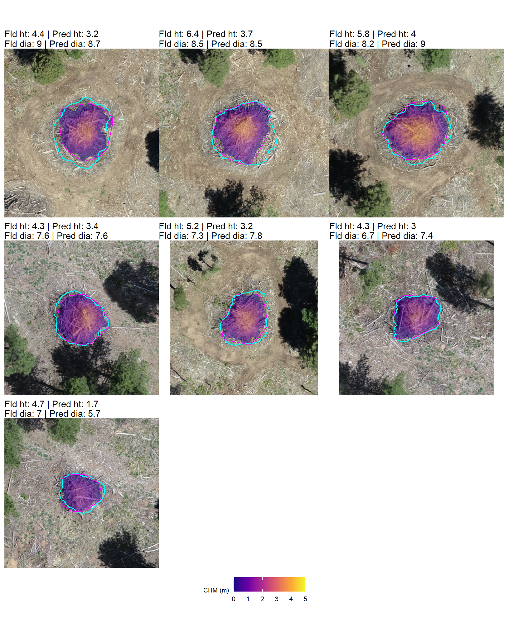
9.5.3 Paraboloid Volume Comparison
The volume comparison immediately above compared the reference paraboloid volume using a geometric shape assumption (paraboloid) with the predicted irregular CHM volume based on the irregular CHM elevation profile. Thus, the volume difference included the impact of the shape assumption. In an attempt to remove the influence of comparing a regular shape (field measured) to an irregular shape (predicted irregular CHM volume), we’ll perform a comparison analysis where both volume calculations are based on the same paraboloid shape assumption. This should provide insight into the differences related only to the predicted versus field-measured maximum dimensions of height and diameter.
In the following section, we compare volume predictions against field measured data where both volume calculations utilize the same paraboloid shape assumption. For this analysis, we’ll update the predicted irregular CHM volume only using the following volume definitions:
- field-measured piles
- volume assumes a paraboloid shape, with volume calculated using the field-measured diameter (as the width) and height. we’ll refer to this as “reference paraboloid volume” to indicate the field measurement is derived using a shape assumption.
- predicted piles
- volume assumes a paraboloid shape, with volume calculated using the predicted diameter (as the width) and height. we’ll refer to this as “predicted paraboloid volume” to indicate the measurement is derived using a shape assumption.
We would generally expect that the reference paraboloid volume will not be uniformly larger or smaller than the predicted paraboloid volume, as the volume difference will be the net result of two competing influences: the overestimation/underestimation of diameter and the overestimation/underestimation of height propagating through the volume calculation formula.
let’s first update the predicted irregular CHM volume to calculate the predicted paraboloid volume where the volume formula for a paraboloid is:
\[ V = \frac{1}{8}\pi \cdot width^2 \cdot height \]
# calculate paraboloid volume
dbscan_gt_pred_match[["psinf"]] <-
  dbscan_gt_pred_match[["psinf"]] %>%
  dplyr::mutate(
    pred_allom_volume_m3 = (1/8) * pi * (pred_diameter_m^2) * pred_height_m
  )
watershed_gt_pred_match[["psinf"]] <-
  watershed_gt_pred_match[["psinf"]] %>%
  dplyr::mutate(
    pred_allom_volume_m3 = (1/8) * pi * (pred_diameter_m^2) * pred_height_m
  )
# summarize it
dbscan_gt_pred_match[["psinf"]] %>%
  dplyr::filter(match_grp=="true positive") %>%
  dplyr::select(field_volume_m3, pred_volume_m3, pred_allom_volume_m3) %>%
  summary()
## field_volume_m3 pred_volume_m3 pred_allom_volume_m3
## Min. : 4.270 Min. : 1.710 Min. : 2.822
## 1st Qu.: 6.602 1st Qu.: 4.449 1st Qu.: 6.912
## Median : 7.536 Median : 5.346 Median : 8.201
## Mean : 15.403 Mean : 8.889 Mean : 14.445
## 3rd Qu.: 8.777 3rd Qu.: 7.341 3rd Qu.: 12.133
## Max. :183.080 Max. :89.497 Max. :127.365nice, the predicted paraboloid volume is larger than the predicted irregular CHM volume calculated based on the irregular elevation profile in the CHM
before we compare the volume measurements in aggregate, let’s look at the distributions
vol_df_temp <-
  dbscan_gt_pred_match[["psinf"]] %>%
  dplyr::filter(match_grp=="true positive") %>%
  dplyr::select(pile_id,field_volume_m3,pred_allom_volume_m3) %>%
  tidyr::pivot_longer(cols = -c(pile_id)) %>%
  dplyr::mutate(
    name = factor(
      name
      , ordered = T
      , levels = c("field_volume_m3","pred_allom_volume_m3")
      , labels = c(
        "reference paraboloid volume"
        , "predicted paraboloid volume"
      )
    )
  )
# plot dist
vol_df_temp %>%
  ggplot2::ggplot(mapping = ggplot2::aes(x = value, color = name, fill = name)) +
  ggplot2::geom_density(mapping = ggplot2::aes(y=ggplot2::after_stat(scaled)), alpha = 0.7) +
  harrypotter::scale_color_hp_d(option = "hermionegranger") +
  harrypotter::scale_fill_hp_d(option = "hermionegranger") +
  ggplot2::scale_y_continuous(NULL,breaks=NULL) +
  ggplot2::labs(
    color="",fill="",x=latex2exp::TeX("allometric volume $m^3$")
    , subtitle = latex2exp::TeX("paraboloid vs. paraboloid bulk volume ($m^3$) comparison of distributions")
  ) +
  ggplot2::theme_light() +
  ggplot2::theme(
    legend.position = "top"
  )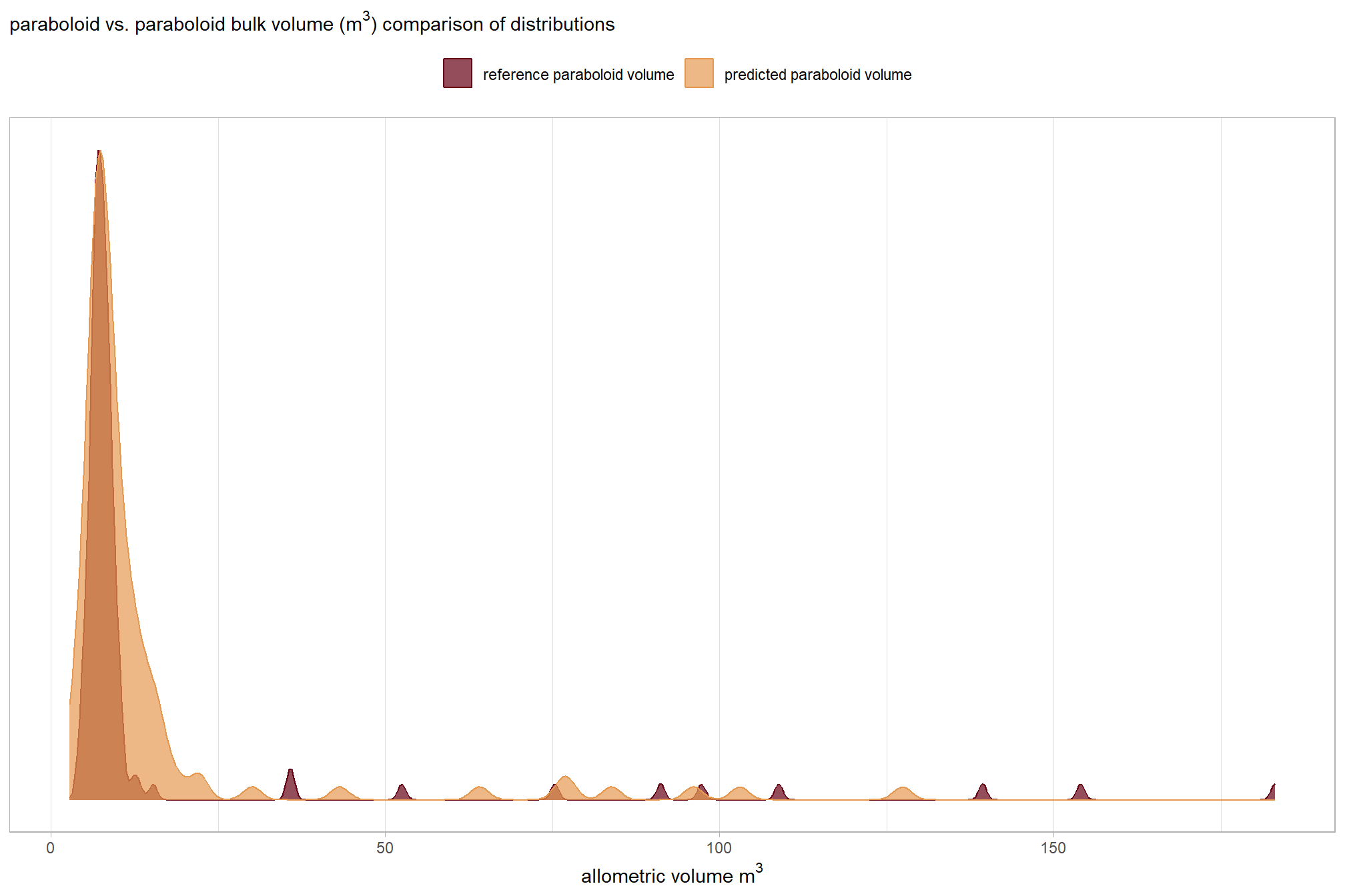
nice, the distributions overlap much more than the volume comparison between the reference paraboloid value and the irregular, CHM-derived prediction
slope plots are neat too
vol_df_temp %>%
  ggplot2::ggplot(
    mapping = ggplot2::aes(x = name, y = value, group = pile_id)
  ) +
  ggplot2::geom_line(key_glyph = "point", alpha = 0.7, color = "gray", lwd = 1.1) +
  ggplot2::geom_point(mapping = ggplot2::aes(color = name), alpha = 0.7, size = 2.5) +
  harrypotter::scale_color_hp_d(option = "hermionegranger") +
  ggplot2::labs(
    color=""
    , y = latex2exp::TeX("allometric volume $m^3$")
    , x = ""
    , subtitle = latex2exp::TeX("praboloid vs. paraboloid bulk volume ($m^3$) comparison at the pile level")
  ) +
  ggplot2::theme_light() +
  ggplot2::theme(
    legend.position = "none"
    , axis.title = ggplot2::element_text(size = 10)
    , axis.text = ggplot2::element_text(size = 10)
  )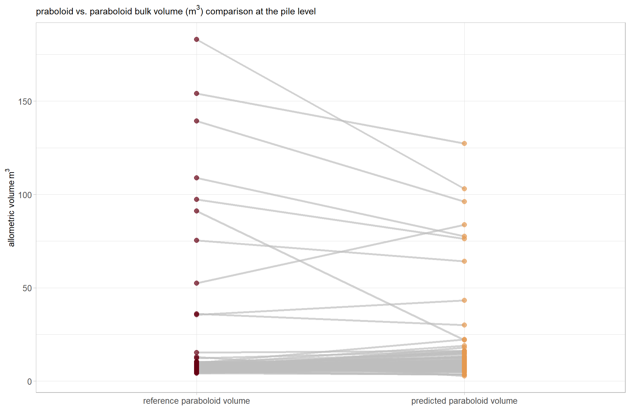
what if we only look at the smaller piles?
vol_df_temp %>%
  dplyr::ungroup() %>%
  dplyr::mutate(x = value < quantile(vol_df_temp$value, probs = 0.90)) %>%
  dplyr::group_by(pile_id) %>%
  dplyr::filter(
    max(x) == 1
  ) %>%
  ggplot2::ggplot(
    mapping = ggplot2::aes(x = name, y = value, group = pile_id)
  ) +
  ggplot2::geom_line(key_glyph = "point", alpha = 0.7, color = "gray", lwd = 1.1) +
  ggplot2::geom_point(mapping = ggplot2::aes(color = name), alpha = 0.7, size = 2.5) +
  harrypotter::scale_color_hp_d(option = "hermionegranger") +
  ggplot2::labs(
    color=""
    , y = latex2exp::TeX("volume $m^3$")
    , x = ""
    , subtitle = latex2exp::TeX("paraboloid vs. paraboloid bulk volume ($m^3$) comparison at the pile level for the smaller piles")
  ) +
  ggplot2::theme_light() +
  ggplot2::theme(
    legend.position = "none"
    , axis.title = ggplot2::element_text(size = 10)
    , axis.text = ggplot2::element_text(size = 10)
  )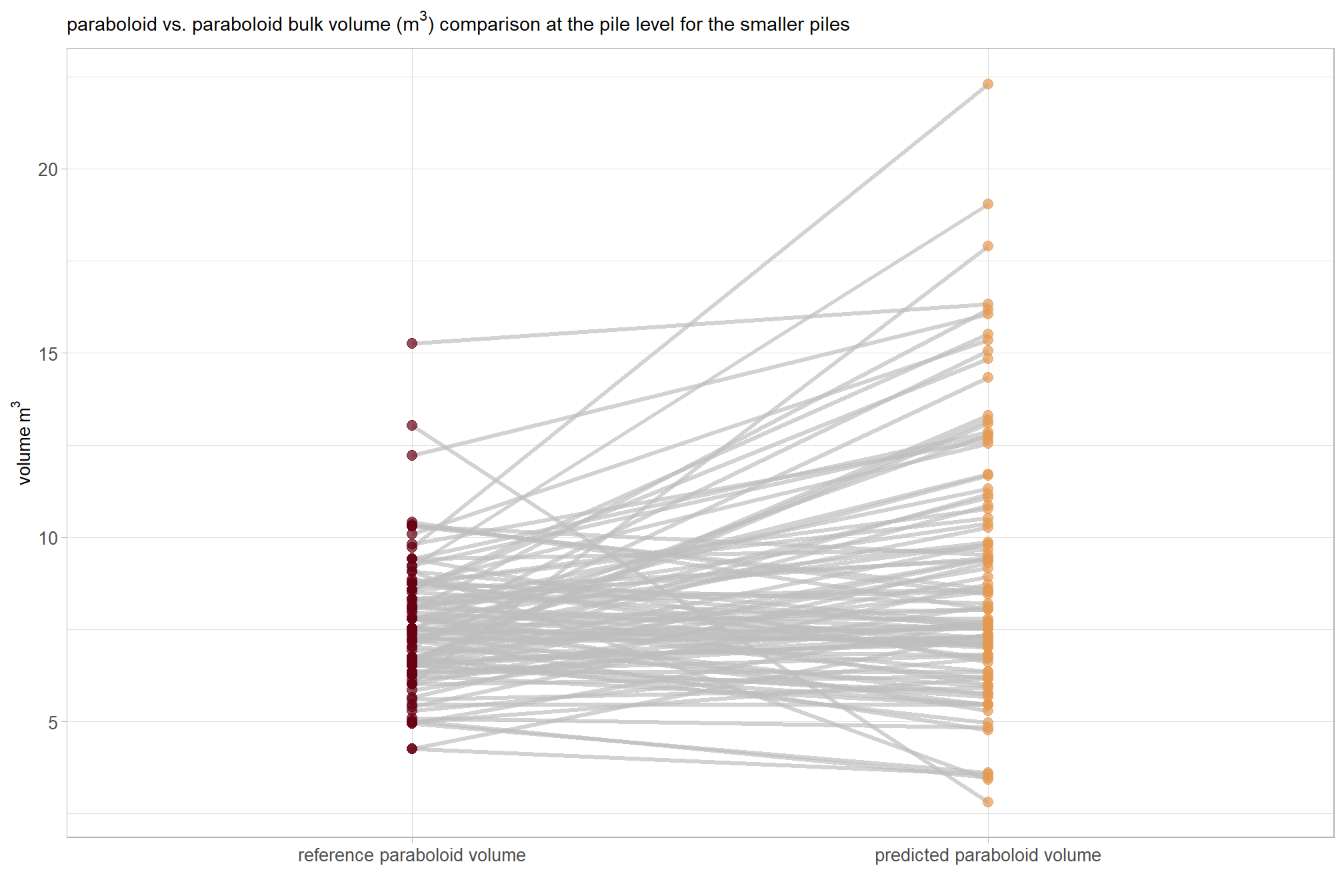
there is much more variability in this slope plot than the volume comparison between the reference paraboloid value and the irregular, CHM-derived prediction
let’s compare aggregated volume measurements for the true positive matches
vol_agg_df_temp <-
  dbscan_gt_pred_match[["psinf"]] %>%
  dplyr::filter(match_grp=="true positive") %>%
  dplyr::ungroup() %>%
  dplyr::summarise(
    mean_diff = mean(field_volume_m3-pred_allom_volume_m3)
    , sd_diff = sd(field_volume_m3-pred_allom_volume_m3)
    , mean_field_volume_m3 = mean(field_volume_m3,na.rm = T)
    , mean_pred_allom_volume_m3 = mean(pred_allom_volume_m3,na.rm = T)
  ) %>%
  dplyr::mutate(
    pct_mean_diff = mean_diff/mean_pred_allom_volume_m3
  )
what did we get?
vol_agg_df_temp %>%
  tidyr::pivot_longer(dplyr::everything()) %>%
  dplyr::mutate(
    value =
      dplyr::case_when(
        stringr::str_starts(name, "pct_") ~ scales::percent(value, accuracy = 0.1)
        , T ~ scales::comma(value, accuracy = 0.1)
      )
  ) %>%
  kableExtra::kbl(
    caption = "comparison of aggregated reference paraboloid volume and predicted paraboloid volume"
    , col.names = c("metric", "value")
  ) %>%
kableExtra::kable_styling()| metric | value |
|---|---|
| mean_diff | 1.0 |
| sd_diff | 12.4 |
| mean_field_volume_m3 | 15.4 |
| mean_pred_allom_volume_m3 | 14.4 |
| pct_mean_diff | 6.6% |
we’ll dig into the MD shortly but before we move on let’s focus on the percent mean difference. We calcualted a %MD of 6.6% which indicates a slight systematic difference where the reference paraboloid volume is, on average, 6.6% larger than our predicted allometric volume.
let’s make a Bland-Altman plot to compare the two measurement methods. this plot uses the average of the two measurements (approximate size) on the x-axis and the difference (bias) between the two measurements on the y-axis
dbscan_gt_pred_match[["psinf"]] %>%
  dplyr::filter(match_grp=="true positive") %>%
  dplyr::ungroup() %>%
  # calc needed metrics
  dplyr::mutate(
    mean_vol = (field_volume_m3+pred_allom_volume_m3)/2
    , diff_vol = (field_volume_m3-pred_allom_volume_m3) # match the order used in vol_agg_df_temp
    , scale_diff = ifelse(diff_vol < 0, -abs(diff_vol) / abs(min(diff_vol)), diff_vol / max(diff_vol))
  ) %>%
  # ggplot() + geom_point(aes(x=diff_vol,y=0, color=scale_diff)) + scale_color_gradient2(mid = "gray", midpoint = 0, low = "red", high = "blue")
  # plot
  ggplot2::ggplot(
    mapping = ggplot2::aes(x = mean_vol, y = diff_vol)
  ) +
  ggplot2::geom_hline(yintercept = 0, color = "black", lwd = 1.2) +
  # mean difference (bias)
  ggplot2::geom_hline(
    yintercept = vol_agg_df_temp$mean_diff
    , linetype = "dashed", color = "blue", lwd = 1
  ) +
  # upper limit
  ggplot2::geom_hline(
    yintercept = vol_agg_df_temp$mean_diff+1.96*vol_agg_df_temp$sd_diff
    , linetype = "dotted", color = "red", lwd = 1
  ) +
  # lower limit
  ggplot2::geom_hline(
    yintercept = vol_agg_df_temp$mean_diff-1.96*vol_agg_df_temp$sd_diff
    , linetype = "dotted", color = "red", lwd = 1
  ) +
  # annotations
  ggplot2::annotate(
    "text"
    , x = Inf
    , y = vol_agg_df_temp$mean_diff
    , label = latex2exp::TeX(
      paste0(
        "mean difference (bias): "
        , scales::comma(vol_agg_df_temp$mean_diff, accuracy = 0.01)
        , " $m^3$"
      )
      , output = "character"
    )
    , vjust = -0.5
    , hjust = 1
    , color = "blue"
    , size = 4
    , parse = TRUE
  ) +
  ggplot2::annotate(
    "text"
    , x = Inf
    , y = vol_agg_df_temp$mean_diff+1.96*vol_agg_df_temp$sd_diff
    , label = latex2exp::TeX(
      paste0(
        "+1.96 SD: "
        , scales::comma(vol_agg_df_temp$mean_diff+1.96*vol_agg_df_temp$sd_diff, accuracy = 0.01)
        , " $m^3$"
      )
      , output = "character"
    )
    , vjust = -0.5
    , hjust = 1
    , color = "red"
    , size = 4
    , parse = TRUE
  ) +
  ggplot2::annotate(
    "text"
    , x = Inf
    , y = vol_agg_df_temp$mean_diff-1.96*vol_agg_df_temp$sd_diff
    , label = latex2exp::TeX(
      paste0(
        "-1.96 SD: "
        , scales::comma(vol_agg_df_temp$mean_diff-1.96*vol_agg_df_temp$sd_diff, accuracy = 0.01)
        , " $m^3$"
      )
      , output = "character"
    )
    , vjust = 1.5
    , hjust = 1
    , color = "red"
    , size = 4
    , parse = TRUE
  ) +
  # points
  ggplot2::geom_point(mapping = ggplot2::aes(color = scale_diff), size = 1.9, alpha = 0.8) +
  ggplot2::scale_color_steps2(mid = "gray", midpoint = 0) +
  ggplot2::labs(
    subtitle = "Bland-Altman plot: reference paraboloid volume vs predicted paraboloid volume"
    , x = latex2exp::TeX("mean allometric volume ($m^3$)")
    , y = latex2exp::TeX("difference (reference paraboloid - predicted paraboloid volume $m^3$)")
  ) +
  ggplot2::theme_light() +
  ggplot2::theme(legend.position = "none")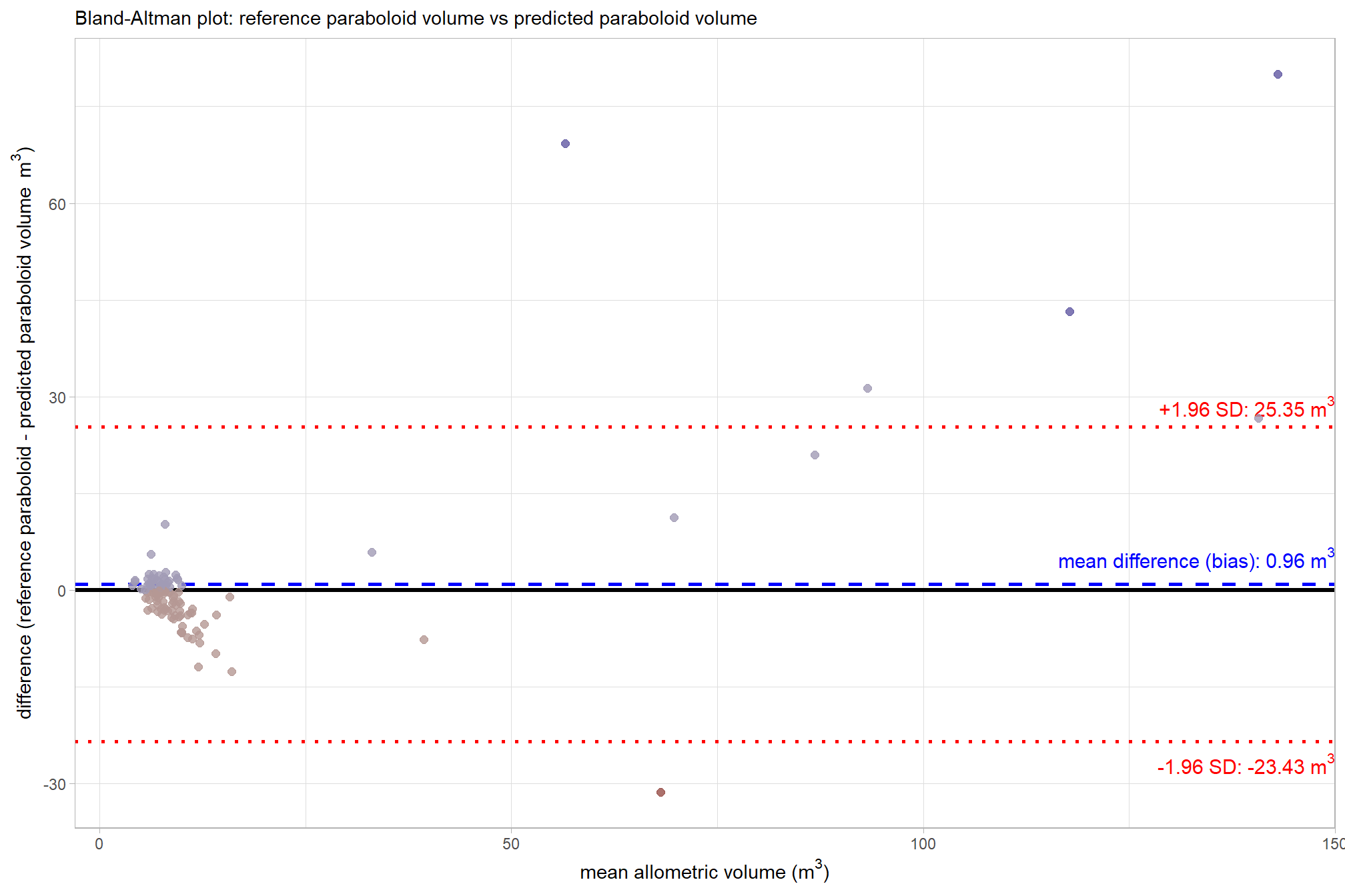
That’s a lot of plotting to show that the mean difference is 0.96 m3. This is a significant improvement over our comparison between the reference paraboloid value and the irregular, CHM-derived prediction
let’s use a paired t-test to determine if the mean difference (MD) between the reference paraboloid volume and the predicted paraboloid volume is statistically significant (i.e. significantly different from zero)
# is the mean difference between the two volumes significantly different from zero
ttest2 <- t.test(
  dbscan_gt_pred_match[["psinf"]] %>%
    dplyr::filter(match_grp == "true positive") %>%
    dplyr::pull(field_volume_m3)
  , dbscan_gt_pred_match[["psinf"]] %>%
    dplyr::filter(match_grp == "true positive") %>%
    dplyr::pull(pred_allom_volume_m3)
  , paired = TRUE
)
ttest2
##
## Paired t-test
##
## data: dbscan_gt_pred_match[["psinf"]] %>% dplyr::filter(match_grp == "true positive") %>% dplyr::pull(field_volume_m3) and dbscan_gt_pred_match[["psinf"]] %>% dplyr::filter(match_grp == "true positive") %>% dplyr::pull(pred_allom_volume_m3)
## t = 0.82545, df = 114, p-value = 0.4108
## alternative hypothesis: true mean difference is not equal to 0
## 95 percent confidence interval:
## -1.340997 3.256869
## sample estimates:
## mean difference
## 0.9579359Wow, the p-value of 0.411 is greater than 0.05 (even 0.10), meaning we fail to reject the null hypothesis that the true mean difference is zero. That is, the mean difference between the field-measured volume and the predicted irregular CHM volume is not different than zero when both are forced to use the same paraboloid shape assumption. This contrasts sharply with the previously observed major systematic difference between the reference paraboloid volume and the predicted irregular, CHM-derived volume. The non-significant difference strongly suggests that the major volume discrepancy noted earlier was primarily due to the geometric irregularity of the actual piles, and not to systematic prediction bias in our CHM-derived height and diameter measurements.
let’s make a table to show the summary of paired t-test results comparing field-based reference volume to predicted volumes that separates the two distinct comparisons into their own sections to quickly see the impact of the geometric shape assumption versus the impact of the predicted height and diameter inputs
dbscan_gt_pred_match[["psinf"]] %>%
  dplyr::filter(match_grp == "true positive") %>%
  dplyr::ungroup() %>%
  dplyr::select(field_volume_m3, pred_volume_m3, pred_allom_volume_m3) %>%
  # dplyr::mutate(d = field_volume_m3-pred_volume_m3) %>%
  dplyr::summarise(dplyr::across(.cols = dplyr::everything(), ~mean(.x,na.rm=T)), n=dplyr::n()) %>%
  tidyr::pivot_longer(
    cols = -c(field_volume_m3,n)
  ) %>%
  dplyr::mutate(
    md = ifelse(
        name=="pred_volume_m3"
        , ttest1$estimate
        , ttest2$estimate
      ) %>%
      scales::comma(accuracy = 0.01)
    , p = ifelse(
        name=="pred_volume_m3"
        , ttest1$p.value
        , ttest2$p.value
      )
    , p_pretty = dplyr::case_when(
      p < 0.001 ~ "p < 0.001 ***"
      , p < 0.01  ~ paste0("p = ", format(round(p, 3)), " **")
      , p < 0.05  ~ paste0("p = ", format(round(p, 3)), " *")
      , TRUE            ~ paste0("p = ", format(round(p, 3)), " (ns)")
    )
    , name = dplyr::recode_values(
      name
      , "pred_volume_m3" ~ "Comparison 1:<br>Reference Paraboloid vs. Predicted Irregular CHM"
      , "pred_allom_volume_m3" ~ "Comparison 2:<br>Reference Paraboloid vs. Predicted Paraboloid"
    )
    , n = scales::comma(n,accuracy=1)
    , dplyr::across(
      .cols = dplyr::where(is.numeric)
      , ~scales::comma(.x,accuracy=0.01)
    )
  ) %>%
  dplyr::relocate(name,n) %>%
  dplyr::select(-c(p)) %>%
  kableExtra::kbl(
    caption = "comparison of field-measured paraboloid volumes to<br>predicted volumes from irregular CHM data<br>and simplified predicted paraboloid geometry"
    , col.names = c(
      "comparison", "TP predictions"
      , "Mean Reference Volume (m<sup>3</sup>)"
      , "Mean Predicted Volume (m<sup>3</sup>)"
      , "Mean Difference (m<sup>3</sup>)"
      , "p-value"
    )
    , escape = F
    # , digits = 2
  ) %>%
kableExtra::kable_styling()| comparison | TP predictions | Mean Reference Volume (m3) | Mean Predicted Volume (m3) | Mean Difference (m3) | p-value |
|---|---|---|---|---|---|
|
Comparison 1: Reference Paraboloid vs. Predicted Irregular CHM |
115 | 15.40 | 8.89 | 6.51 | p < 0.001 *** |
|
Comparison 2: Reference Paraboloid vs. Predicted Paraboloid |
115 | 15.40 | 14.44 | 0.96 | p = 0.411 (ns) |
9.5.4 Paraboloid vs. Paraboloid: Comparison of Individual Piles
# # get prediction for r2
lm_temp <- lm(
  pred_allom_volume_m3 ~ field_volume_m3
  , data =
    dbscan_gt_pred_match[["psinf"]] %>%
    dplyr::filter(match_grp=="true positive")
)
# summary(lm_temp)
# scales::percent(summary(lm_temp)$r.squared, accuracy = 0.1)
# summary(lm_temp) %>% names()
lmf_temp <- paste0(
  "y = "
  , scales::number(summary(lm_temp)$coefficients[2,1], accuracy = 0.01) #slope
  , "x"
  , ifelse(summary(lm_temp)$coefficients[1,1]<0," - ", " + ")
  , scales::number(abs(summary(lm_temp)$coefficients[1,1]), accuracy = 0.01) #intercept
)

volume_comp_scatter2 <-
  dbscan_gt_pred_match[["psinf"]] %>%
  dplyr::filter(match_grp=="true positive") %>%
  dplyr::bind_cols(
    all_stand_boundary %>%
      sf::st_drop_geometry() %>%
      dplyr::filter(site_data_lab=="psinf") %>%
      dplyr::select(site_data_lab, site_full_lab)
  ) %>%
  ggplot2::ggplot(mapping = ggplot2::aes(y = pred_allom_volume_m3, x = field_volume_m3)) +
  ggplot2::geom_abline(color = "gray33", lwd = 1) +
  ggplot2::geom_point(color = "navy", alpha = 0.7, size = 2) +
  ggplot2::geom_smooth(lwd = 0.8, method = "lm", se=F, color = "gray", linetype = "dashed") +
  ggplot2::annotate(
    "text",
    x = -Inf, y = Inf # Top Left
    , label =
      paste0(
        "MD = "
        , scales::comma(ttest2$estimate, accuracy = 0.01, suffix = " (m³)")
        , "\n"
        , lmf_temp
        , "\n R² = "
        # , scales::number((summary(lm_temp)$r.squared)*100, accuracy = 0.1, suffix = "%")
        , scales::number((summary(lm_temp)$r.squared), accuracy = 0.01)
      )
    , hjust = -0.1, vjust = 1.1
    , parse = F
    , size = 3.5
  ) +
  ggplot2::scale_x_continuous(limits = c(0, max( max(dbscan_gt_pred_match[["psinf"]]$pred_volume_m3,na.rm=T), max(dbscan_gt_pred_match[["psinf"]]$field_volume_m3,na.rm=T) )*1.02 )) +
  ggplot2::scale_y_continuous(limits = c(0, max( max(dbscan_gt_pred_match[["psinf"]]$pred_volume_m3,na.rm=T), max(dbscan_gt_pred_match[["psinf"]]$field_volume_m3,na.rm=T) )*1.02 )) +
  ggplot2::facet_wrap(facets = dplyr::vars(site_full_lab), scales = "free", axis.labels = "all") +
  ggplot2::labs(
    x = latex2exp::TeX("reference paraboloid volume $m^3$")
    , y = latex2exp::TeX("predicted paraboloid volume $m^3$")
    # , subtitle = latex2exp::TeX("bulk volume ($m^3$) comparison")
    , subtitle = "(b) Predicted Paraboloid versus Reference Paraboloid Volume"
  ) +
  ggplot2::theme_light() +
  ggplot2::theme(
    plot.subtitle = ggplot2::element_text(face = "bold")
    , strip.text = ggplot2::element_text(face = "bold", color = "black")
  )
# volume_comp_scatter2
combine the scatter plots
patchwork::wrap_plots(
  list(
    volume_comp_scatter1 # + ggplot2::labs(subtitle = "A: Predicted Irregular CHM Volume versus Reference Paraboloid Volume")
    , volume_comp_scatter2 # + ggplot2::labs(subtitle = "B: Predicted Paraboloid Volume versus Reference Paraboloid Volume")
  )
  , nrow = 1
) &
ggplot2::theme(
 plot.subtitle = ggplot2::element_text(size = 9)
 , axis.text = ggplot2::element_text(size = 7)
 , axis.title = ggplot2::element_text(size = 7)
)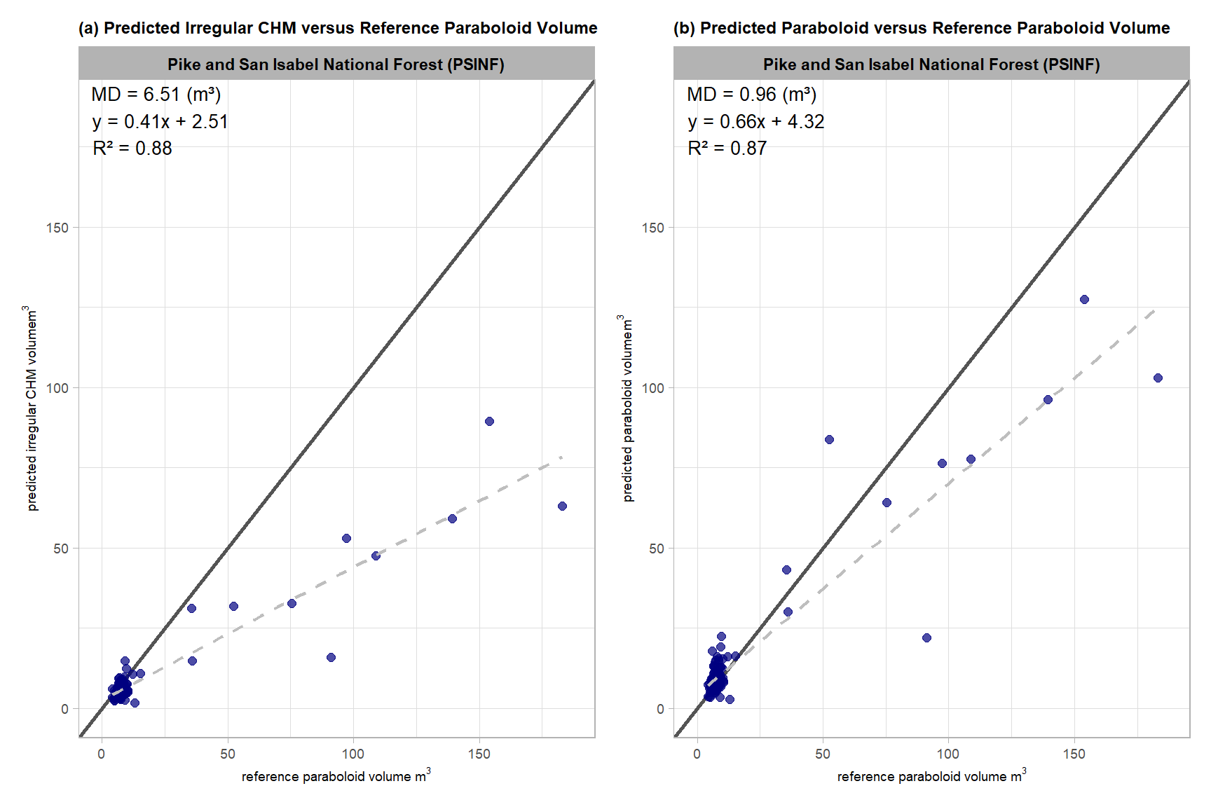
the differences between the predictions for the larger field measured piles are pulling the slope of the line upwards but for the smaller piles, the volume differences are clustered around the line of equality
9.5.5 Stand-level Aggregation
Let’s summarize the measurement values of the predictions (true positive and false positive) and the ground truth data (true positive and false negative) over the entire stand (this is similar to a basal area comparison in a forest inventory). Summarizing the predicted and ground truth pile height and diameter form measurements for all instances across the entire study area, regardless of whether individual piles were successfully matched between datasets, for comparison provides insight into the method’s aggregated performance in predicting total pile size in an area. Such totals are often required for administrative needs like submitting burn permits which do not typically focus on individual pile quantification differences.
# do it
sum_df_temp <-
  dplyr::bind_rows(
    dbscan_gt_pred_match[["psinf"]] %>%
      dplyr::mutate(
        pred_allom_volume_m3 = (1/8) * pi * (pred_diameter_m^2) * pred_height_m
        , field_allom_volume_m3 = field_volume_m3
      ) %>%
      stand_agg_fn() %>%
      dplyr::mutate(method = "dbscan")
    , watershed_gt_pred_match[["psinf"]] %>%
      dplyr::mutate(
        pred_allom_volume_m3 = (1/8) * pi * (pred_diameter_m^2) * pred_height_m
        , field_allom_volume_m3 = field_volume_m3
      ) %>%
      stand_agg_fn() %>%
      dplyr::mutate(method = "watershed")
  ) %>%
  dplyr::filter(
    stringr::str_detect(tolower(pile_metric),"volume")
  )
# sum_df_temp %>% dplyr::glimpse()
plot the aggregated, stand-level volume comparison between field-measured and predicted piles
# plot it
sum_df_temp %>%
  dplyr::ungroup() %>%
  dplyr::mutate(
    stand_id=1
    , lab = paste0(
      scales::comma(value,accuracy=0.1)
      , dplyr::case_when(
        is.na(pct_diff) ~ ""
        , T ~ paste0(
          "\n"
          , ifelse(pct_diff<0,"-","+")
          ,scales::percent(abs(pct_diff),accuracy=0.1)
        )
      )
    )
    , method = method %>%
      factor(ordered = T) %>%
      forcats::fct_recode("DBSCAN" = "dbscan", "Watershed" = "watershed")
  ) %>%
  ggplot2::ggplot(
    mapping = ggplot2::aes(
      x = which_data
      , y = value
      , label = lab
      , group = stand_id
    )
  ) +
  ggplot2::geom_line(key_glyph = "point", alpha = 0.7, color = "gray", lwd = 1.1) +
  ggplot2::geom_col(mapping = ggplot2::aes(fill = which_data), alpha = 1, width = 0.4) +
  harrypotter::scale_color_hp_d(option = "hermionegranger") +
  harrypotter::scale_fill_hp_d(option = "hermionegranger") +
  ggplot2::geom_text(
    vjust = -0.25
  ) +
  ggplot2::facet_grid(
    rows = dplyr::vars(pile_metric)
    , cols = dplyr::vars(method)
    , scales = "free_y", axes = "all_x"
    , switch = "y"
    # , labeller = ggplot2::label_wrap_gen(width = 20)
  ) +
  ggplot2::scale_y_continuous(labels = scales::comma, expand = ggplot2::expansion(mult = c(0,.3)), breaks = NULL) +
  ggplot2::labs(
    x = "", y = ""
    , subtitle = "Comparison of aggregated volume estimates at the PSINF site"
  ) +
  ggplot2::theme_light() +
  ggplot2::theme(
    legend.position = "none"
    , axis.text.x = ggplot2::element_text(size = 11, color = "black", face = "bold")
    , strip.text.x = ggplot2::element_text(size = 11, color = "black", face = "bold")
    , strip.text.y = ggplot2::element_text(size = 9, color = "black", face = "bold")
    , panel.grid = ggplot2::element_blank()
) 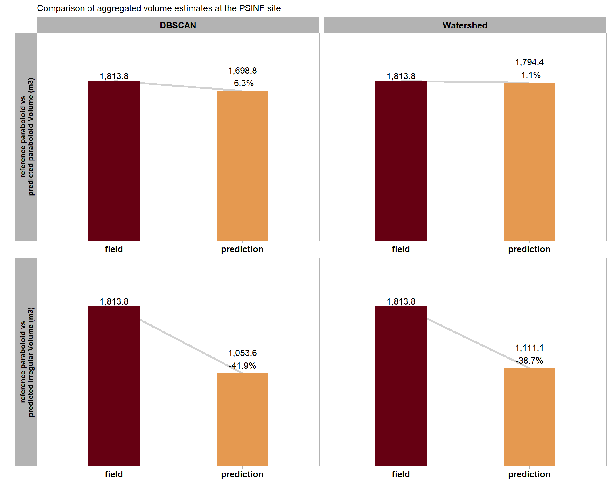
table the aggregated, stand-level volume comparison between field-measured and predicted piles
sum_df_temp %>%
  dplyr::mutate(
    pile_metric=dplyr::case_when(
      stringr::str_detect(tolower(pile_metric),"irregular") ~ "irregular"
      , T ~ "paraboloid"
    )
    , value = scales::comma(value,accuracy=0.1)
    , pct_diff = scales::percent(pct_diff,accuracy=0.1)
  ) %>%
  tidyr::pivot_wider(
    id_cols = method
    , values_from = c(value,pct_diff)
    , names_from = c(pile_metric,which_data)
  ) %>%
  dplyr::select(dplyr::where(~ !all(is.na(.x)))) %>%
  dplyr::rename_with(
    .cols = dplyr::everything()
    , .fn = ~ dplyr::case_when(
      stringr::str_starts(.x,"value_") ~ stringr::str_remove(.x,"^value_") %>% stringr::str_c("_value")
      , stringr::str_starts(.x,"pct_diff_") ~ stringr::str_remove(.x,"^pct_diff_") %>% stringr::str_c("_zzpct_diff")
      , T ~ .x
    )
  ) %>%
  dplyr::select(order(colnames(.))) %>%
  dplyr::mutate(site = all_stand_boundary %>% dplyr::filter(site_data_lab=="psinf") %>% dplyr::pull(site)) %>%
  dplyr::relocate(site,method) %>%
  dplyr::arrange(site,method) %>%
  kableExtra::kbl(
    caption = "Comparison of aggregated volume estimates at the PSINF site"
    , col.names = c(
      "site", "method"
      , rep(c("Field","Predicted","Pct Diff"), times = 2)
    )
    , escape = F
    # , digits = 2
  ) %>%
  kableExtra::kable_styling(font_size = 11.5) %>%
  kableExtra::add_header_above(c(
    " "=2
    , "reference paraboloid vs predicted paraboloid Volume (m<sup>3</sup>)" = 3
    , "reference paraboloid vs predicted irregular Volume (m<sup>3</sup>)" = 3
  ),escape = F) %>%
  kableExtra::column_spec(seq(2,8,by=3), border_right = TRUE, include_thead = TRUE) %>%
  # kableExtra::column_spec(
  #   column = 2:8
  #   , extra_css = "font-size: 10px;"
  #   , include_thead = T
  # ) %>%
kableExtra::collapse_rows(columns = 1, valign = "top")| site | method | Field | Predicted | Pct Diff | Field | Predicted | Pct Diff |
|---|---|---|---|---|---|---|---|
| PSINF Mixed Conifer Site | dbscan | 1,813.8 | 1,053.6 | -41.9% | 1,813.8 | 1,698.8 | -6.3% |
| watershed | 1,813.8 | 1,111.1 | -38.7% | 1,813.8 | 1,794.4 | -1.1% |
9.6 All Stand-Level Aggregates
Let’s summarize the measurement values of the predictions (true positive and false positive) and the reference data (true positive and false negative) over the entire stand (this is similar to a basal area comparison in a forest inventory). Summarizing the predicted and ground truth pile height and diameter form measurements for all instances across the entire study area, regardless of whether individual piles were successfully matched between datasets, for comparison provides insight into the method’s aggregated performance in predicting total pile size in an area. Such totals are often required for administrative needs like submitting burn permits which do not typically focus on individual pile quantification differences.
9.6.1 Area
# do it
sum_df_temp <-
  all_stand_boundary$site_data_lab %>%
  purrr::map(
    \(x)
    dplyr::bind_rows(
      dbscan_gt_pred_match[[x]] %>%
        stand_agg_fn(which_comp = "gt") %>%
        dplyr::mutate(
          method = "dbscan"
          , site = all_stand_boundary %>% dplyr::filter(site_data_lab==x) %>% dplyr::pull(site)
          , site_full_lab = all_stand_boundary %>% dplyr::filter(site_data_lab==x) %>% dplyr::pull(site_full_lab)
        )
    ) %>%
    dplyr::filter(
      stringr::str_detect(tolower(pile_metric),"area")
    )
  ) %>%
  dplyr::bind_rows()

# sum_df_temp %>% dplyr::glimpse()
plot the aggregated, stand-level area comparison between image-annotated and predicted piles
# plot it
plt_area <- sum_df_temp %>%
  dplyr::ungroup() %>%
  dplyr::mutate(
    stand_id=1
    , lab = paste0(
      scales::comma(value,accuracy=0.1)
      , dplyr::case_when(
        is.na(pct_diff) ~ ""
        , T ~ paste0(
          "\n"
          , ifelse(pct_diff<0,"-","+")
          ,scales::percent(abs(pct_diff),accuracy=0.1)
        )
      )
    )
    , site_full_lab = stringr::str_wrap(site_full_lab, width=26)
    , which_data = forcats::fct_recode(which_data, "reference"="image-annotated", "predicted"="prediction")
  ) %>%
  ggplot2::ggplot(
    mapping = ggplot2::aes(
      x = which_data
      , y = value
      , label = lab
      , group = site_full_lab
    )
  ) +
  ggplot2::geom_line(key_glyph = "point", alpha = 0.7, color = "gray", lwd = 1.1) +
  ggplot2::geom_col(mapping = ggplot2::aes(fill = which_data), alpha = 1, width = 0.4) +
  harrypotter::scale_color_hp_d(option = "hermionegranger") +
  harrypotter::scale_fill_hp_d(option = "hermionegranger") +
  ggplot2::geom_text(
    vjust = -0.25
    , size = 3
  ) +
  ggplot2::facet_wrap(
    facets = dplyr::vars(site_full_lab), scales = "free", axis.labels = "all"
    , nrow = 1
    # , labeller = ggplot2::labeller(class = ggplot2::label_wrap_gen(width = 10))
  ) +
  ggplot2::scale_y_continuous(labels = scales::comma, expand = ggplot2::expansion(mult = c(0,0.2)), breaks = NULL) +
  ggplot2::labs(
    x = ""
    , y = "treament total\npile area (m²)"
    # , y = latex2exp::TeX("treament total pile area ($m^2$)")
    # , color = "image-field\ndiameter diff."
    # , subtitle = latex2exp::TeX("bulk volume ($m^3$) comparison")
    , subtitle = "(c) Treatment-Wide Total Pile Area"
  ) +
  ggplot2::theme_light() +
  ggplot2::theme(
    legend.position = "none"
    , strip.text = ggplot2::element_text(face = "bold", color = "black")
    , axis.text.x = ggplot2::element_text(size = 10, color = "black", face = "bold")
    , panel.grid = ggplot2::element_blank()
    , plot.subtitle = ggplot2::element_text(face = "bold")
  )
plt_area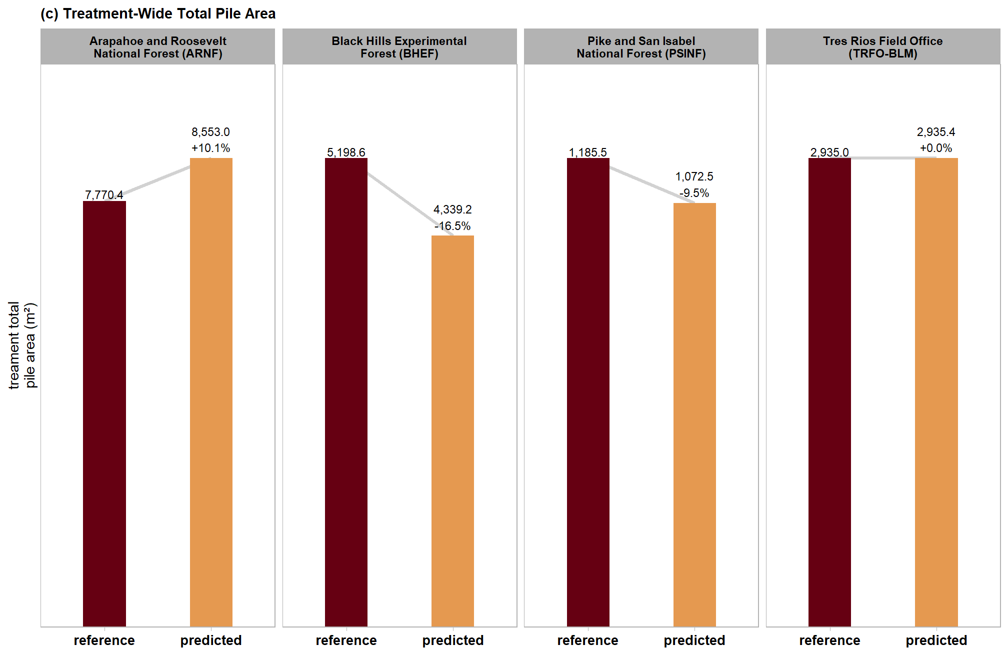
table the aggregated, stand-level area comparison between image-annotated and predicted piles
sum_df_temp %>%
  dplyr::mutate(
    pile_metric=stringr::word(pile_metric)
    , value = scales::comma(value,accuracy=0.1)
    , pct_diff = scales::percent(pct_diff,accuracy=0.1)
  ) %>%
  tidyr::pivot_wider(
    id_cols = c(site_full_lab)
    , values_from = c(value,pct_diff,n)
    , names_from = c(pile_metric,which_data)
  ) %>%
  dplyr::select(dplyr::where(~ !all(is.na(.x)))) %>%
  dplyr::rename_with(
    .cols = dplyr::everything()
    , .fn = ~ dplyr::case_when(
      stringr::str_starts(.x,"value_") ~ stringr::str_remove(.x,"^value_") %>% stringr::str_c("_value")
      , stringr::str_starts(.x,"pct_diff_") ~ stringr::str_remove(.x,"^pct_diff_") %>% stringr::str_c("_zzpct_diff")
      , T ~ .x
    )
  ) %>%
  dplyr::select(order(colnames(.))) %>%
  dplyr::relocate(site_full_lab, tidyselect::starts_with("n_")) %>%
  # dplyr::glimpse()
  dplyr::arrange(site_full_lab) %>%
  kableExtra::kbl(
    caption = "Comparison of aggregated area measurements for all sites"
    , col.names = c(
      "site"
      , "reference","predicted" # n
      , rep(c("reference","predicted","pct diff"), times = 1)
    )
    , escape = F
    # , digits = 2
  ) %>%
  kableExtra::kable_styling(font_size = 11.5) %>%
  kableExtra::add_header_above(c(
    " "=1
    # , "Detection" = 3
    # , "Area" = 3
    , "# piles" = 2
    , "Area (m<sup>2</sup>)" = 3
  ),escape = F) %>%
  kableExtra::column_spec(seq(3,6,by=3), border_right = TRUE, include_thead = TRUE) %>%
  # kableExtra::column_spec(
  #   column = 3:9
  #   , extra_css = "font-size: 10px;"
  #   , include_thead = T
  # ) %>%
kableExtra::collapse_rows(columns = 1, valign = "top")| site | reference | predicted | reference | predicted | pct diff |
|---|---|---|---|---|---|
| Arapahoe and Roosevelt National Forest (ARNF) | 19 | 23 | 7,770.4 | 8,553.0 | 10.1% |
| Black Hills Experimental Forest (BHEF) | 26 | 24 | 5,198.6 | 4,339.2 | -16.5% |
| Pike and San Isabel National Forest (PSINF) | 121 | 120 | 1,185.5 | 1,072.5 | -9.5% |
| Tres Rios Field Office (TRFO-BLM) | 276 | 330 | 2,935.0 | 2,935.4 | 0.0% |
9.6.2 Height and Diameter
plot the aggregated, stand-level height and diameter comparison between reference and predicted piles
height
# plot it
plt_ht <-
  dbscan_gt_pred_match[["psinf"]] %>%
  stand_agg_fn() %>%
  dplyr::mutate(
    site = all_stand_boundary %>% dplyr::filter(site_data_lab=="psinf") %>% dplyr::pull(site)
    , site_full_lab = all_stand_boundary %>% dplyr::filter(site_data_lab=="psinf") %>% dplyr::pull(site_full_lab)
  ) %>%
  dplyr::filter(
    stringr::str_detect(tolower(pile_metric),"height")
  ) %>%
  dplyr::ungroup() %>%
  dplyr::mutate(
    stand_id=1
    , lab = paste0(
      scales::comma(value,accuracy=0.1)
      , dplyr::case_when(
        is.na(pct_diff) ~ ""
        , T ~ paste0(
          "\n"
          , ifelse(pct_diff<0,"-","+")
          ,scales::percent(abs(pct_diff),accuracy=0.1)
        )
      )
    )
    , site_full_lab = stringr::str_wrap(site_full_lab, width=26)
    , which_data = forcats::fct_recode(which_data, "reference"="field", "predicted"="prediction")
  ) %>%
  ggplot2::ggplot(
    mapping = ggplot2::aes(
      x = which_data
      , y = value
      , label = lab
      , group = site_full_lab
    )
  ) +
  ggplot2::geom_line(key_glyph = "point", alpha = 0.7, color = "gray", lwd = 1.1) +
  ggplot2::geom_col(mapping = ggplot2::aes(fill = which_data), alpha = 1, width = 0.4) +
  harrypotter::scale_color_hp_d(option = "hermionegranger") +
  harrypotter::scale_fill_hp_d(option = "hermionegranger") +
  ggplot2::geom_text(
    vjust = -0.25
    , size = 3
  ) +
  ggplot2::facet_wrap(
    facets = dplyr::vars(site_full_lab), scales = "free", axis.labels = "all"
    , nrow = 1
    # , labeller = ggplot2::labeller(class = ggplot2::label_wrap_gen(width = 10))
  ) +
  ggplot2::scale_y_continuous(labels = scales::comma, expand = ggplot2::expansion(mult = c(0,0.2)), breaks = NULL) +
  ggplot2::labs(
    x = ""
    , y = "treament total\npile height (m)"
    # , y = latex2exp::TeX("treament total pile area ($m^2$)")
    # , color = "image-field\ndiameter diff."
    # , subtitle = latex2exp::TeX("bulk volume ($m^3$) comparison")
    , subtitle = "(b) Treatment-Wide Total Pile Height"
  ) +
  ggplot2::theme_light() +
  ggplot2::theme(
    legend.position = "none"
    , strip.text = ggplot2::element_text(face = "bold", color = "black")
    , axis.text.x = ggplot2::element_text(size = 10, color = "black", face = "bold")
    , panel.grid = ggplot2::element_blank()
    , plot.subtitle = ggplot2::element_text(face = "bold")
  )
plt_ht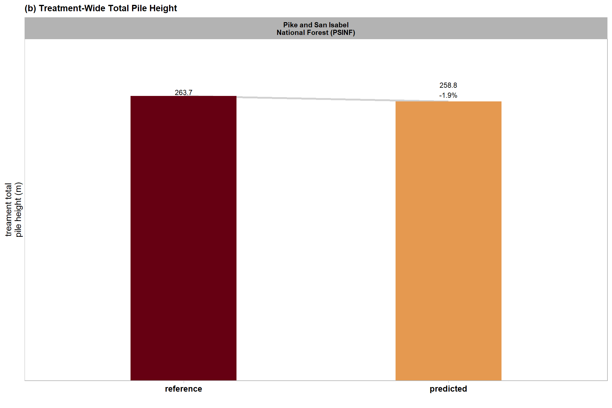
diameter
# plot it
plt_diam <-
  dbscan_gt_pred_match[["psinf"]] %>%
  stand_agg_fn() %>%
  dplyr::mutate(
    site = all_stand_boundary %>% dplyr::filter(site_data_lab=="psinf") %>% dplyr::pull(site)
    , site_full_lab = all_stand_boundary %>% dplyr::filter(site_data_lab=="psinf") %>% dplyr::pull(site_full_lab)
  ) %>%
  dplyr::filter(
    stringr::str_detect(tolower(pile_metric),"diameter")
  ) %>%
  dplyr::ungroup() %>%
  dplyr::mutate(
    stand_id=1
    , lab = paste0(
      scales::comma(value,accuracy=0.1)
      , dplyr::case_when(
        is.na(pct_diff) ~ ""
        , T ~ paste0(
          "\n"
          , ifelse(pct_diff<0,"-","+")
          ,scales::percent(abs(pct_diff),accuracy=0.1)
        )
      )
    )
    , site_full_lab = stringr::str_wrap(site_full_lab, width=26)
    , which_data = forcats::fct_recode(which_data, "reference"="field", "predicted"="prediction")
  ) %>%
  ggplot2::ggplot(
    mapping = ggplot2::aes(
      x = which_data
      , y = value
      , label = lab
      , group = site_full_lab
    )
  ) +
  ggplot2::geom_line(key_glyph = "point", alpha = 0.7, color = "gray", lwd = 1.1) +
  ggplot2::geom_col(mapping = ggplot2::aes(fill = which_data), alpha = 1, width = 0.4) +
  harrypotter::scale_color_hp_d(option = "hermionegranger") +
  harrypotter::scale_fill_hp_d(option = "hermionegranger") +
  ggplot2::geom_text(
    vjust = -0.25
    , size = 3
  ) +
  ggplot2::facet_wrap(
    facets = dplyr::vars(site_full_lab), scales = "free", axis.labels = "all"
    , nrow = 1
    # , labeller = ggplot2::labeller(class = ggplot2::label_wrap_gen(width = 10))
  ) +
  ggplot2::scale_y_continuous(labels = scales::comma, expand = ggplot2::expansion(mult = c(0,0.2)), breaks = NULL) +
  ggplot2::labs(
    x = ""
    , y = "treament total\npile diameter (m)"
    # , y = latex2exp::TeX("treament total pile area ($m^2$)")
    # , color = "image-field\ndiameter diff."
    # , subtitle = latex2exp::TeX("bulk volume ($m^3$) comparison")
    , subtitle = "(a) Treatment-Wide Total Pile Diameter"
  ) +
  ggplot2::theme_light() +
  ggplot2::theme(
    legend.position = "none"
    , strip.text = ggplot2::element_text(face = "bold", color = "black")
    , axis.text.x = ggplot2::element_text(size = 10, color = "black", face = "bold")
    , panel.grid = ggplot2::element_blank()
    , plot.subtitle = ggplot2::element_text(face = "bold")
  )
# plt_diam
combine
p_temp <-
  patchwork::wrap_plots(
  list(
    plt_diam + ggplot2::theme(axis.text.x = ggplot2::element_text(size = 8, color = "black", face = "bold"))
    , plt_ht + ggplot2::theme(axis.text.x = ggplot2::element_text(size = 8, color = "black", face = "bold"))
    # , patchwork::plot_spacer()
    , plt_area + ggplot2::theme(axis.text.x = ggplot2::element_text(size = 7, color = "black", face = "bold"))
  )
  , design = c(
    # t, l, b , r
    patchwork::area(1, 1)
    , patchwork::area(1,2)
    , patchwork::area(2,1,2,2)
    # , patchwork::area(3,1,3,2)
  )
) &
ggplot2::theme(
  axis.title = ggplot2::element_text(size = 8, color = "black", face = "bold")
)
plot it
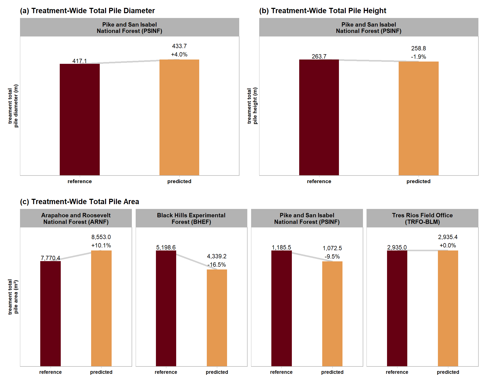
9.6.3 Table Area, Diam, Ht
sum_df_temp %>%
  dplyr::mutate(
    pile_metric=stringr::word(pile_metric)
    , value = scales::comma(value,accuracy=0.1)
    , pct_diff = scales::percent(pct_diff,accuracy=0.1)
  ) %>%
  tidyr::pivot_wider(
    id_cols = c(site_full_lab)
    , values_from = c(value,pct_diff,n)
    , names_from = c(pile_metric,which_data)
  ) %>%
  dplyr::select(dplyr::where(~ !all(is.na(.x)))) %>%
  dplyr::rename_with(
    .cols = dplyr::everything()
    , .fn = ~ dplyr::case_when(
      stringr::str_starts(.x,"value_") ~ stringr::str_remove(.x,"^value_") %>% stringr::str_c("_value")
      , stringr::str_starts(.x,"pct_diff_") ~ stringr::str_remove(.x,"^pct_diff_") %>% stringr::str_c("_zzpct_diff")
      , T ~ .x
    )
  ) %>%
  dplyr::select(order(colnames(.))) %>%
  dplyr::relocate(site_full_lab, tidyselect::starts_with("n_")) %>%
  # dplyr::glimpse()
  dplyr::arrange(site_full_lab) %>%
  dplyr::left_join(
    dbscan_gt_pred_match[["psinf"]] %>%
      stand_agg_fn() %>%
      dplyr::mutate(
        site = all_stand_boundary %>% dplyr::filter(site_data_lab=="psinf") %>% dplyr::pull(site)
        , site_full_lab = all_stand_boundary %>% dplyr::filter(site_data_lab=="psinf") %>% dplyr::pull(site_full_lab)
      ) %>%
      dplyr::filter(
        stringr::str_detect(tolower(pile_metric),"diameter")
        | stringr::str_detect(tolower(pile_metric),"height")
      ) %>%
      dplyr::mutate(
        pile_metric=stringr::word(pile_metric)
        , value = scales::comma(value,accuracy=0.1)
        , pct_diff = scales::percent(pct_diff,accuracy=0.1)
      ) %>%
      tidyr::pivot_wider(
        id_cols = c(site_full_lab)
        , values_from = c(value,pct_diff,n)
        , names_from = c(pile_metric,which_data)
      ) %>%
      dplyr::select(dplyr::where(~ !all(is.na(.x))), -tidyselect::starts_with("n_")) %>%
      dplyr::rename_with(
        .cols = dplyr::everything()
        , .fn = ~ dplyr::case_when(
          stringr::str_starts(.x,"value_") ~ stringr::str_remove(.x,"^value_") %>% stringr::str_c("_value")
          , stringr::str_starts(.x,"pct_diff_") ~ stringr::str_remove(.x,"^pct_diff_") %>% stringr::str_c("_zzpct_diff")
          , T ~ .x
        )
      ) %>%
      dplyr::select(order(colnames(.))) %>%
      dplyr::relocate(site_full_lab)
    , by = "site_full_lab"
  ) %>%
  # dplyr::glimpse()
  kableExtra::kbl(
    caption = "Comparison of aggregated, treatment-wid total measurements for all sites"
    , col.names = c(
      "site"
      , "reference","predicted" # n
      , rep(c("reference","predicted","pct diff"), times = 3)
    )
    , escape = F
    # , digits = 2
  ) %>%
  kableExtra::kable_styling(font_size = 10) %>%
  kableExtra::add_header_above(c(
    " "=1
    # , "Detection" = 3
    # , "Area" = 3
    , "# piles" = 2
    , "Area (m<sup>2</sup>)" = 3
    , "Diameter (m)" = 3
    , "Height (m)" = 3
  ),escape = F) %>%
  kableExtra::column_spec(seq(3,12,by=3), border_right = TRUE, include_thead = TRUE) %>%
  # kableExtra::column_spec(
  #   column = 3:9
  #   , extra_css = "font-size: 10px;"
  #   , include_thead = T
  # ) %>%
kableExtra::collapse_rows(columns = 1, valign = "top")| site | reference | predicted | reference | predicted | pct diff | reference | predicted | pct diff | reference | predicted | pct diff |
|---|---|---|---|---|---|---|---|---|---|---|---|
| Arapahoe and Roosevelt National Forest (ARNF) | 19 | 23 | 7,770.4 | 8,553.0 | 10.1% | NA | NA | NA | NA | NA | NA |
| Black Hills Experimental Forest (BHEF) | 26 | 24 | 5,198.6 | 4,339.2 | -16.5% | NA | NA | NA | NA | NA | NA |
| Pike and San Isabel National Forest (PSINF) | 121 | 120 | 1,185.5 | 1,072.5 | -9.5% | 417.1 | 433.7 | 4.0% | 263.7 | 258.8 | -1.9% |
| Tres Rios Field Office (TRFO-BLM) | 276 | 330 | 2,935.0 | 2,935.4 | 0.0% | NA | NA | NA | NA | NA | NA |